Designer in a Binder Customer Transformations
Want to see what our Designer in a Binder® customers are doing in their own homes using the interior decorating system I've created?! It's pretty amazing!
This post will be updated often with a new Designer in a Binder customer transformation–the most recent transformation is always first. But if you've come here looking for a different one, just scroll down. It is here somewhere!
If you are looking for room transformations in my own home, you can click HERE to tour our old house and click HERE to tour our current home.
Designer in a Binder® Customer Transformations
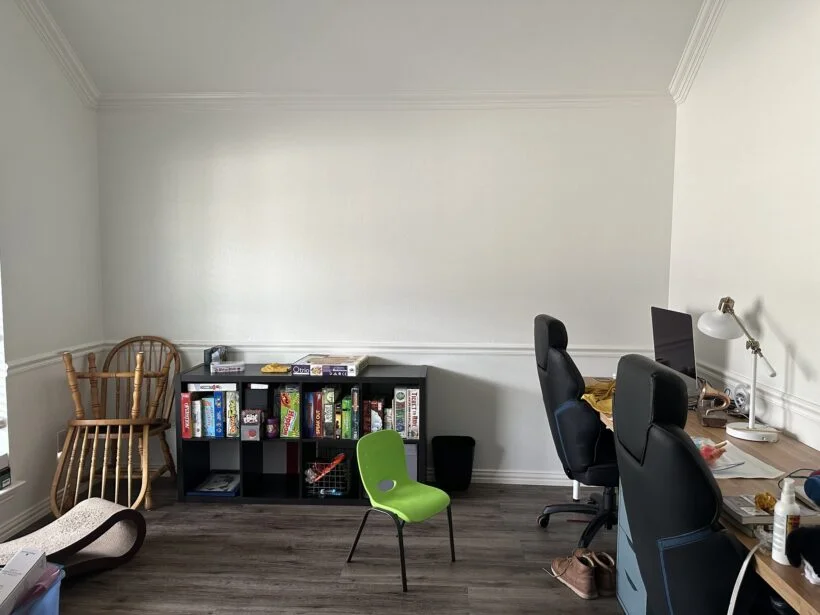
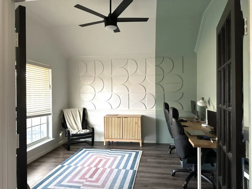
Emily's office transformation is so inspiring. I love the interest she added to the wall with the dimensional tiles and color-blocked paint. And here's what Emily said about how Designer in a Binder helped her with her office makeover: “Using the binder helped me not be impulsive, and the whole office process took about a year before I finally took the plunge and picked up the paintbrush! Before DIAB I would have just painted the room at the very start, and tried to make everything work.”
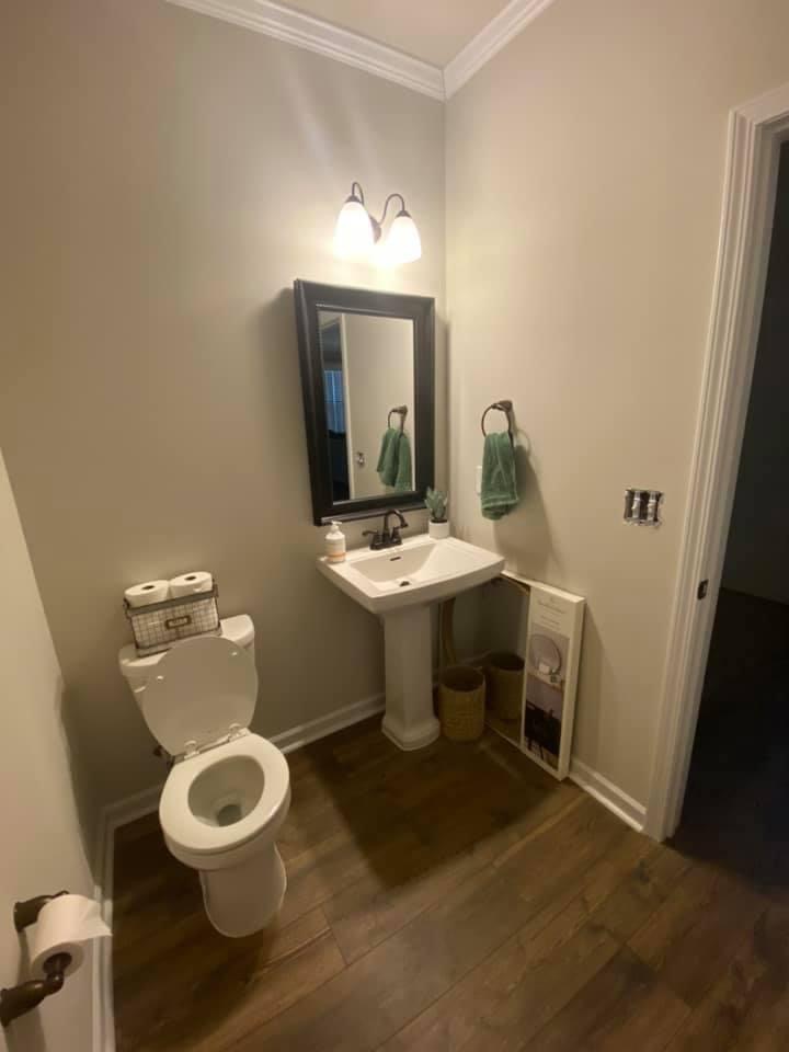
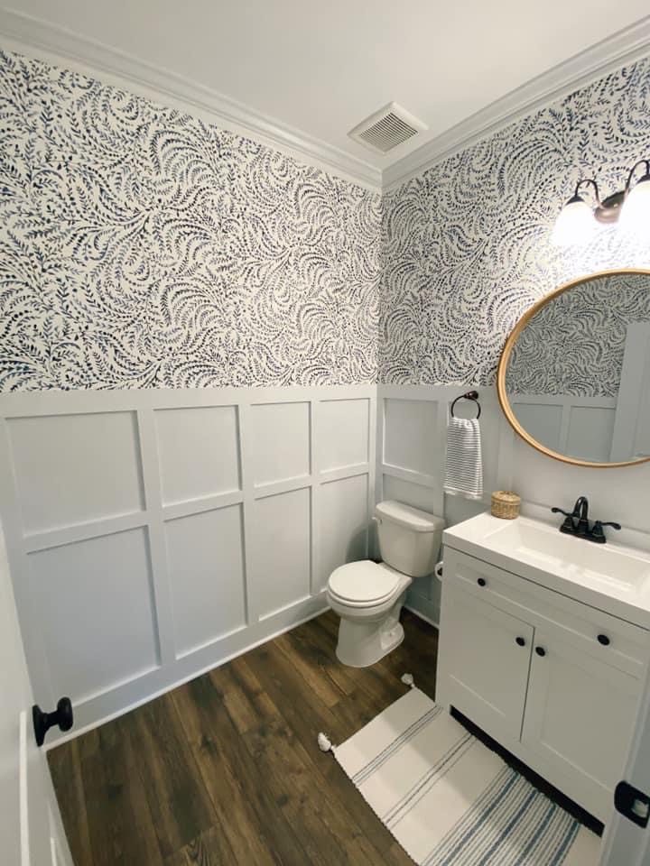
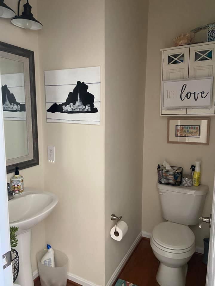
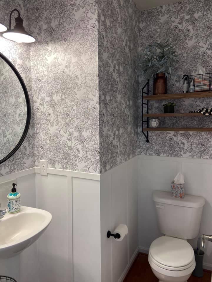
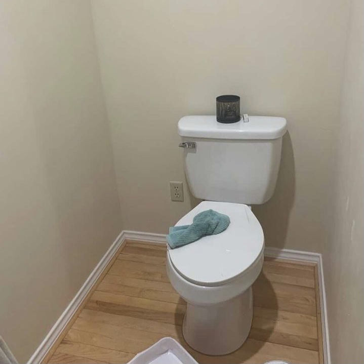
Brooke's bathroom transformation is GORGEOUS! I love how much the board and batten and wallpaper add life to the space. It's proof that neutrals can be incredibly interesting when pattern and texture are incorporated.
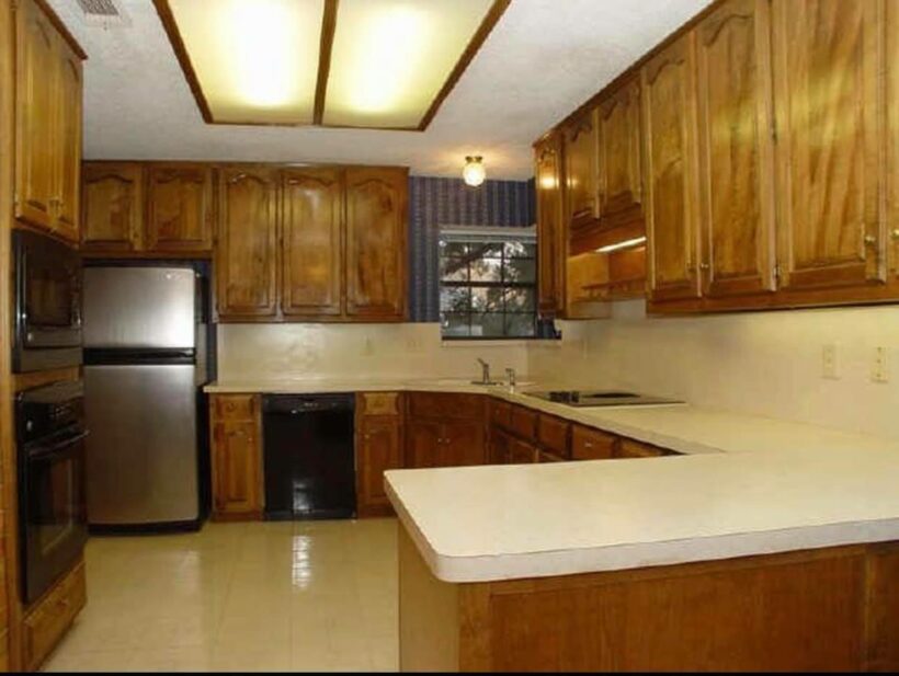
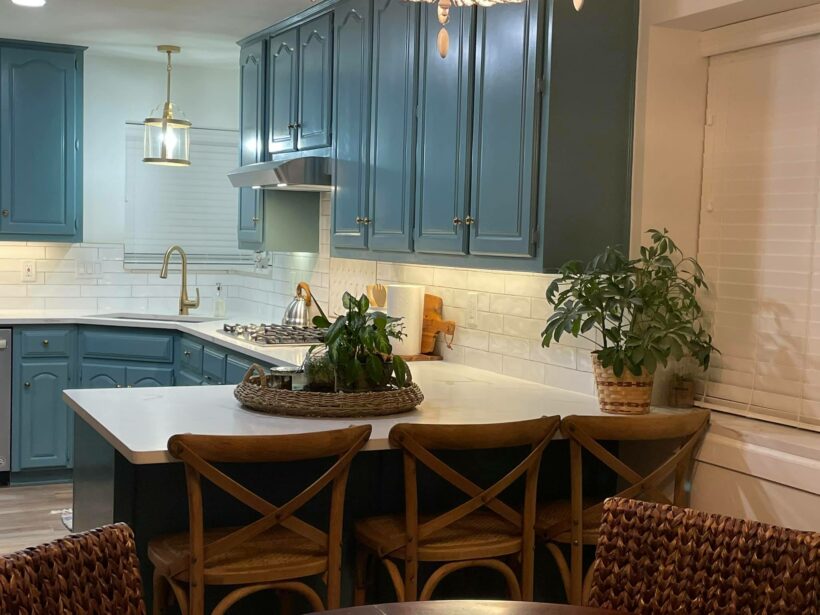
It's been a while since I have had a moment to update this post and some incredible customer transformations have happened! One that caught my eye is this kitchen transformation by Ebby! It looks like an entirely new kitchen without a major renovation. Ebby has been a wonderful member of the Designer in a Binder® private Facebook group since 2021 and has shared several incredible transformations in the group (you can find her dining room further down in this post).
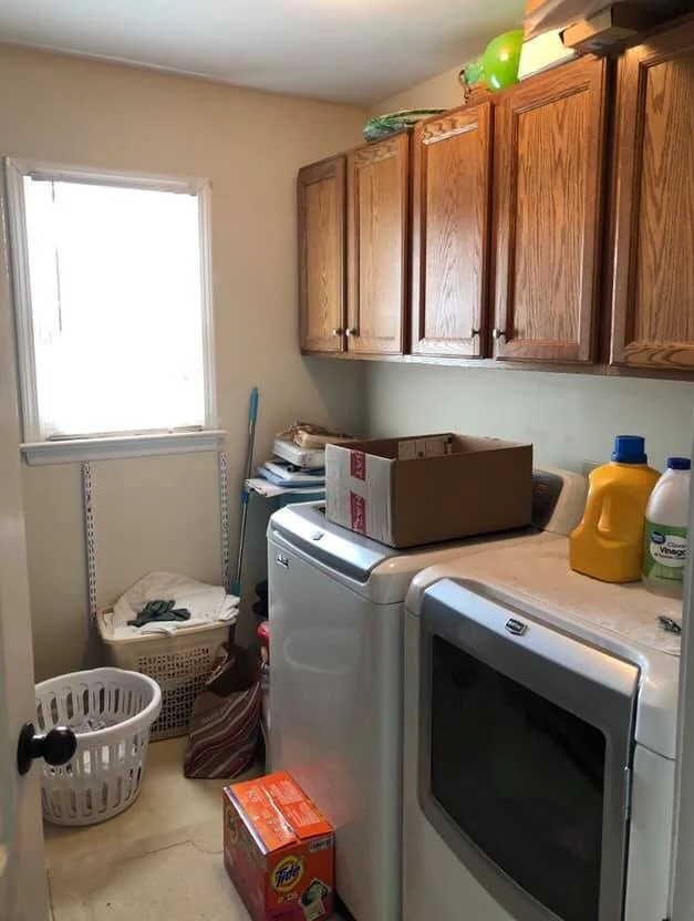
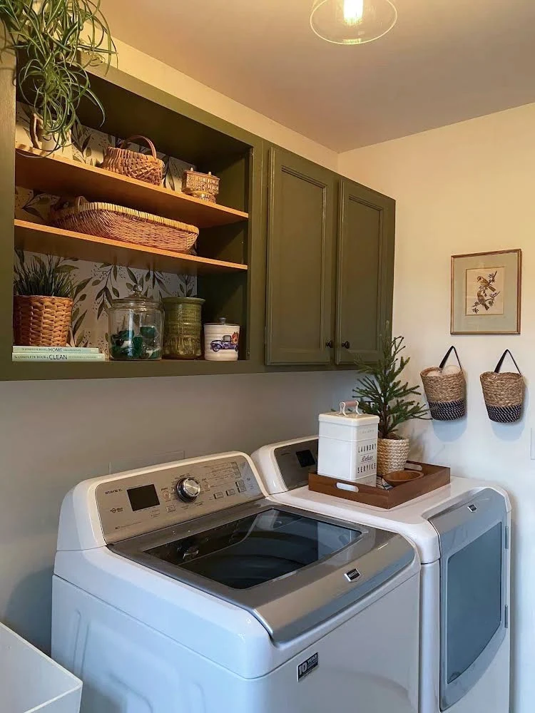
I love Kim's affordable but dramatic changes in her laundry room! Removing cabinet doors and adding some paint and wallpaper makes an incredible difference.
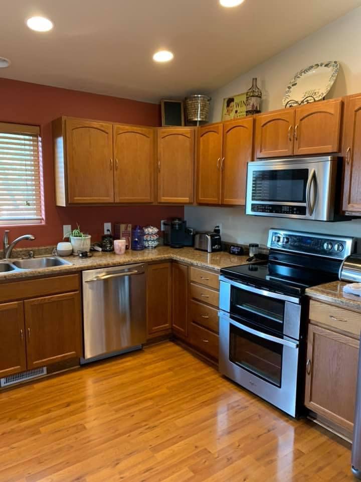
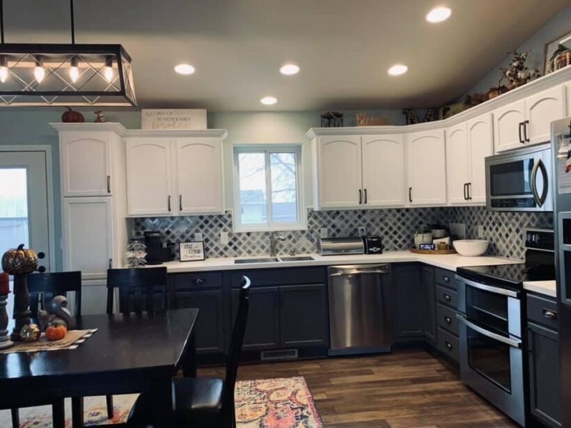
Y'all, Cheri's kitchen is almost unrecognizable even though NONE of the major elements changed. This is what paint and a new backsplash can do 😱
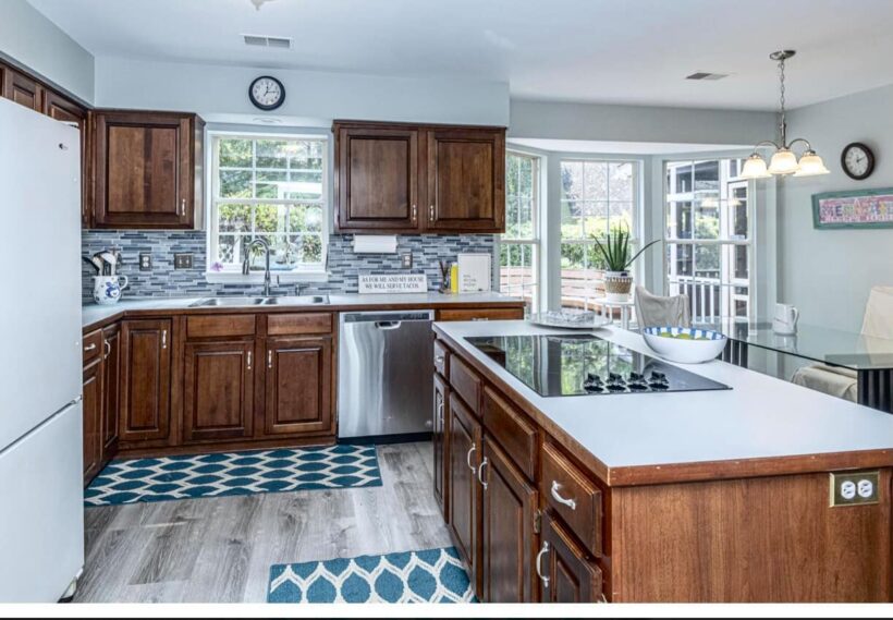
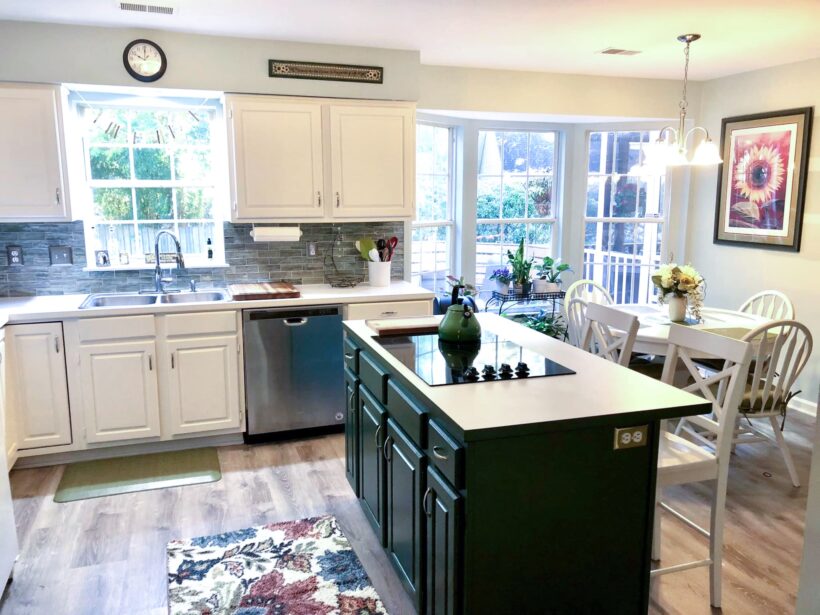
Sabrina's kitchen transformation is such a good example of completely transforming a kitchen WITHOUT doing a huge, expensive remodel! Amazing!
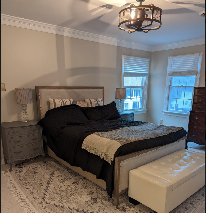
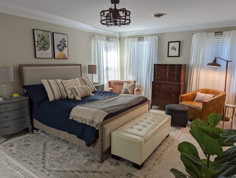
Whitney's bedroom makeover is a great example of how small changes can make a HUGE impact! You don't need a huge budget to make a major change in a room. The chairs, art, throw pillows and curtain panels cozy this room up so much!
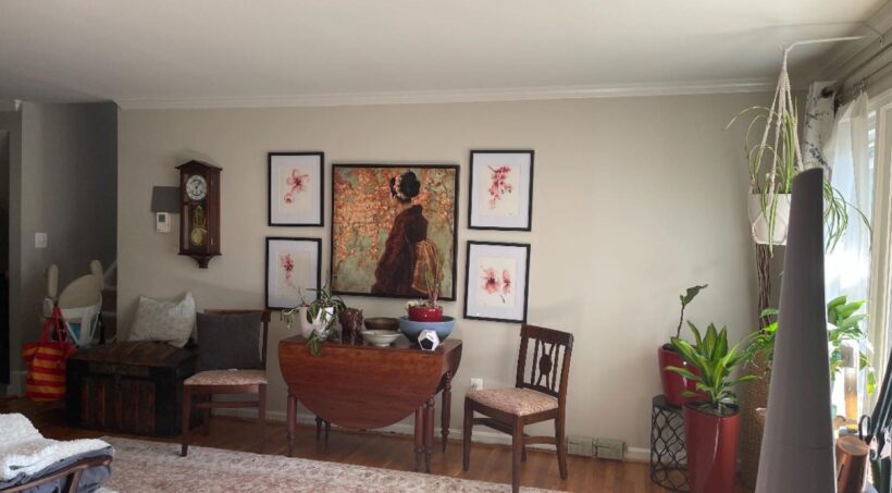
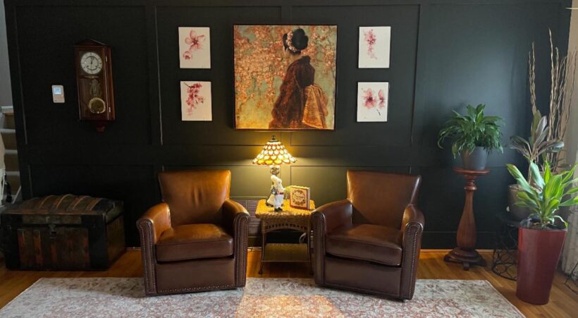
Talk about the power of relatively small changes in this nook of Liz's home! The molding and paint add texture and interest and most importantly, really ground and define this space. She also swapped out the side chairs for comfy, leather armchairs and removed the drop-leaf table in favor of a smaller table that has the correct scale for the space. A total transformation without changing everything!
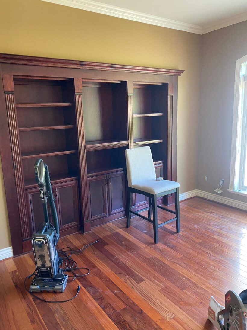
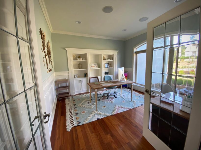
Jen transformed this drab and dreary room into an absolutely gorgeous and functional homeschooling space for her family. I love the rug she chose and the color palette so much. And she really maximized the space with a smart floor plan!
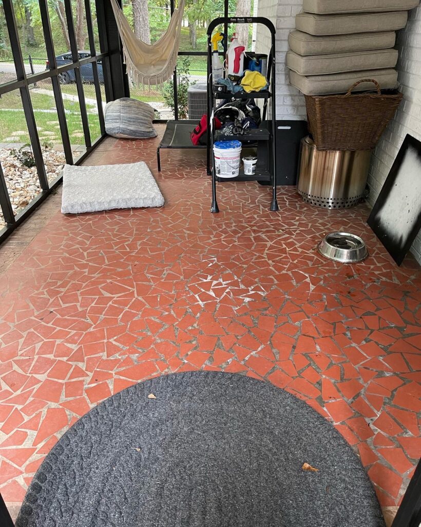
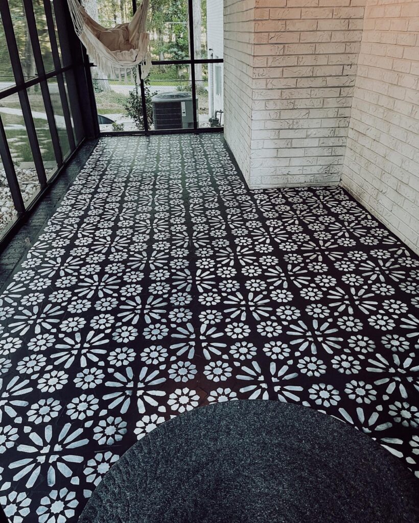
Kristen completely transformed the outdated floor of her screened-in-porch with paint and a stencil. Isn't it INCREDIBLE?! I am amazed by how the texture of the original floor isn't even noticeable anymore!
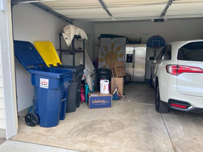
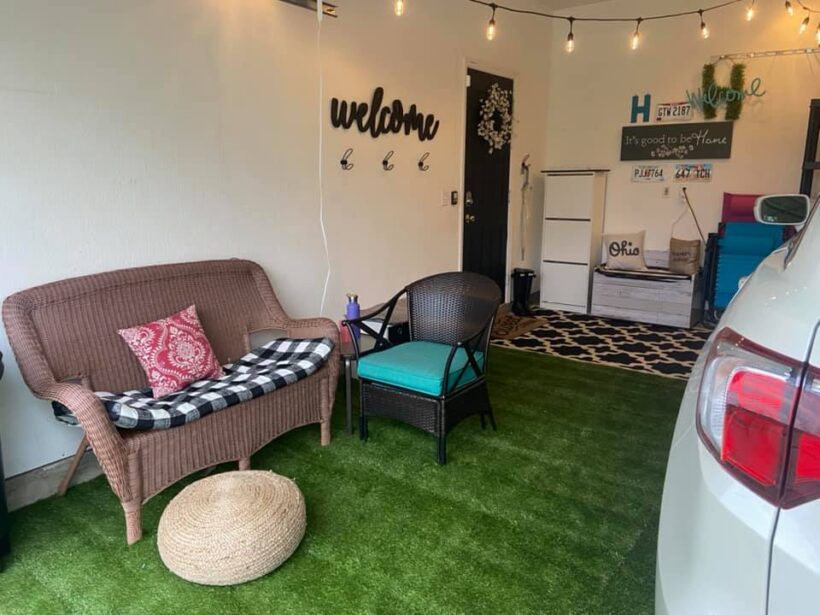
Tonya's garage transformation is a PERFECT example of creating spaces that you will USE even if it's out of the ordinary! I absolutely love what she did to brighten up her garage space since it's the space she enters and exits her home every day. This is what Tonya said when she shared this project, “First time using Designer in a Binder and started in my garage since that is how we enter our home 99% of the time. I have always felt stressed pulling into my trashed, not cute garage but now it has become an extra little patio living space that I have my coffee and visit with my kids and neighbors. I loved using the binder and will now move to my entryway and work my way thru my condo. One room at a time. Also I loved how it helped me focus on just one room, I stopped buying and /or looking for stuff in other rooms, and just focused on my garage. I am so happy with the final product!”
This bathroom transformation by Karen is incredible! I love that it shows how you can completely update a bathroom without changing the layout, which helps keep renovation costs down. And I think I can tell what her crucial element was (an important part of the Designer in a Binder® process)! Can you?


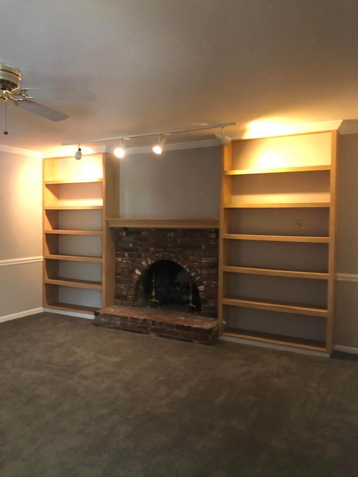
I am in awe of how Rachel used Designer in a Binder® to transform her dated family room. It's so modern and gorgeous now! And she accomplished this without any demolition. She just reinvented the elements already in the space. Beautiful!
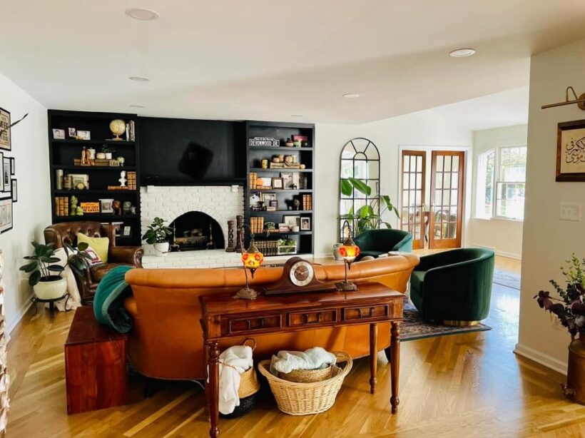
I love what Tracy did to add color and pattern to her formerly boring bathroom with the help of Designer in Binder®. And it's a budget-friendly transformation. She painted her cabinets (this is how I recommend painting cabinets) and painted her countertops (like we painted our kitchen countertops to look like marble).
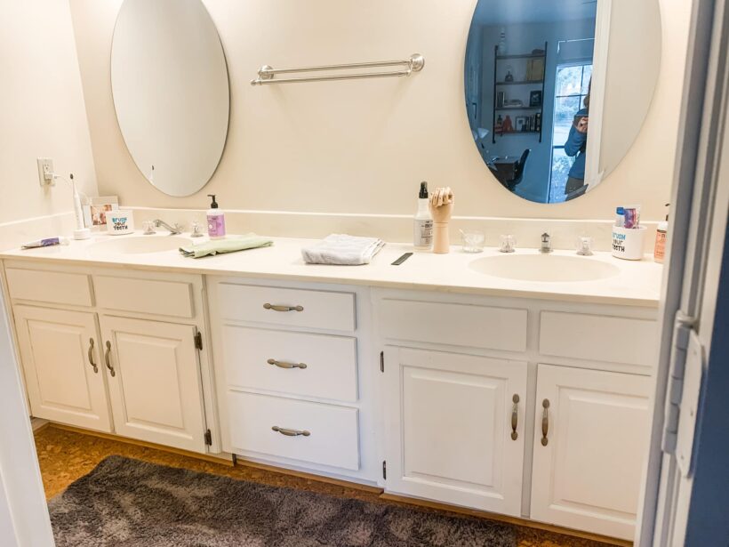
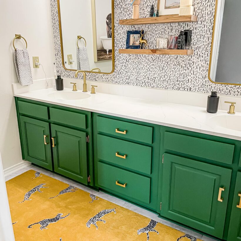
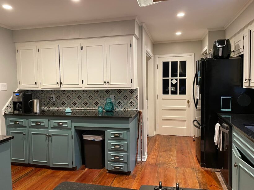
I literally had to compare these photos more than once to confirm that they are the same space! LeAnn's kitchen transformation is dramatic but budget-friendly–my favorite combination. Never underestimate how powerful paint and some creative solutions can be in transforming a space!!!! By taking that shelf out above the cabinets and leveling out the countertop, this kitchen space looks totally different. I'm blown away!
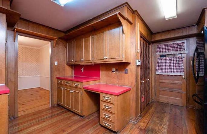
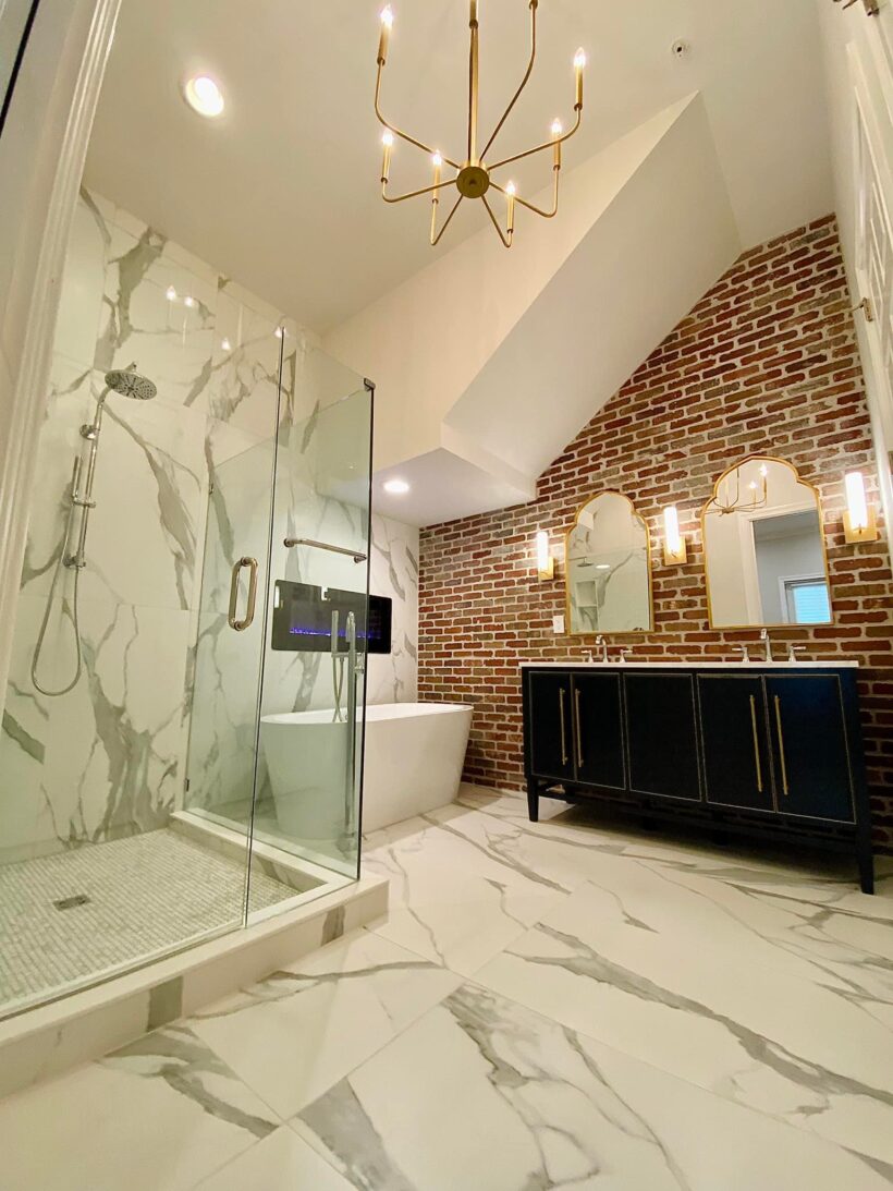
Valerie's bathroom is hands-down one of my favorite Designer in Binder® transformations EVER! It just goes to show that every space has unlimited potential! And I love the juxtaposition of the brick and marble! It's absolutely stunning!
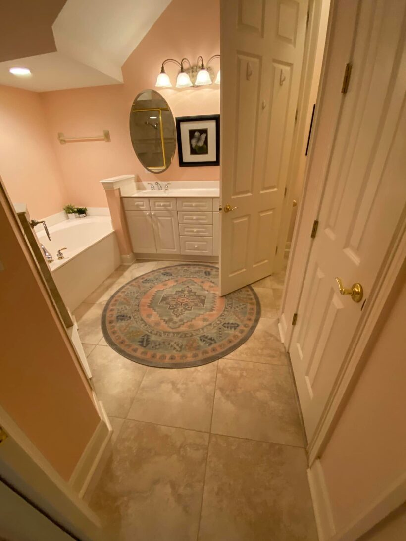
Nancy's lounge transformation using Designer in a Binder®is a good one! The board and batten, the light fixture, the color palette are all beautiful!
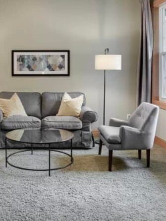
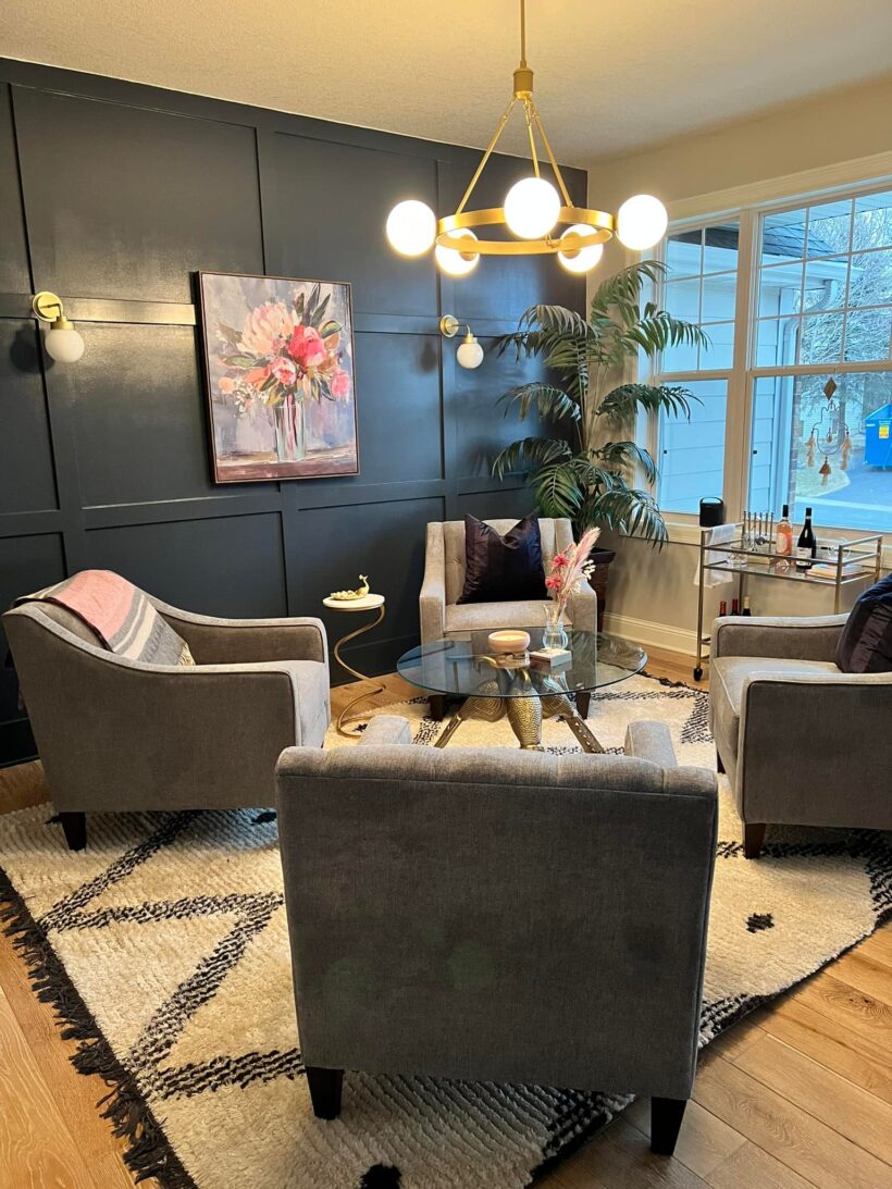
Karen's bathroom transformation is a BIG one! I love how she incorporated the tips in Designer in a Binder about adding in texture and dimension with that wood wall treatment. And she obviously used her crucial element to guide her color choices. It's so good!
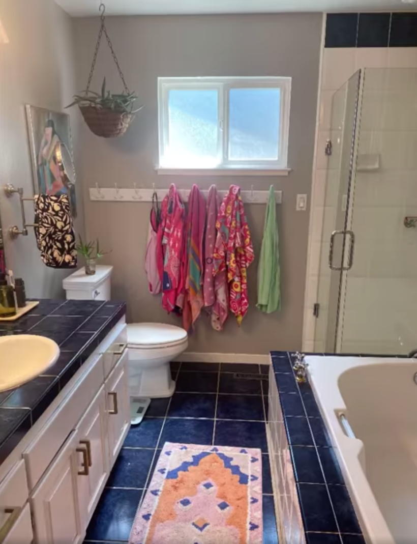
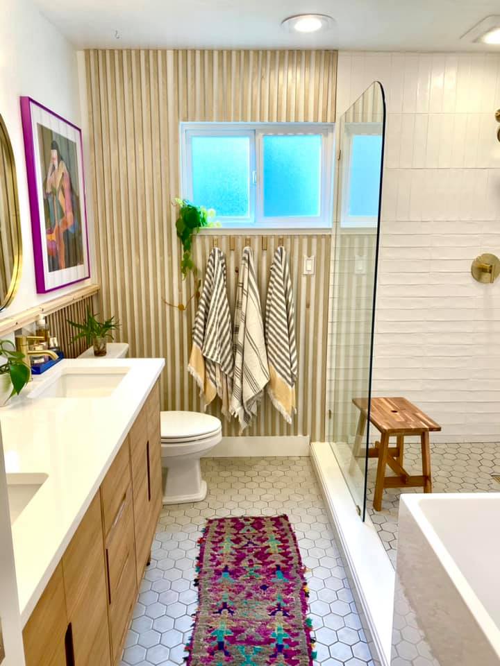
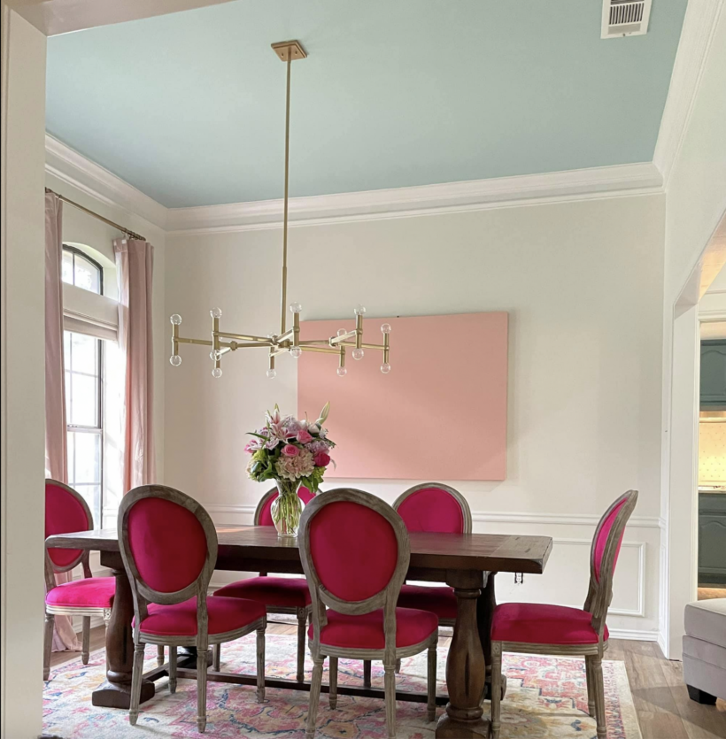
Ebby has been a member of the Designer in a Binder® private Facebook group since 2021 and has shared some AMAZING room transformations with our community. I have loved them all, but her dining room transformation is still my favorite! I love this transformation so much. And I think Ebby may love the color pink as much as I do!
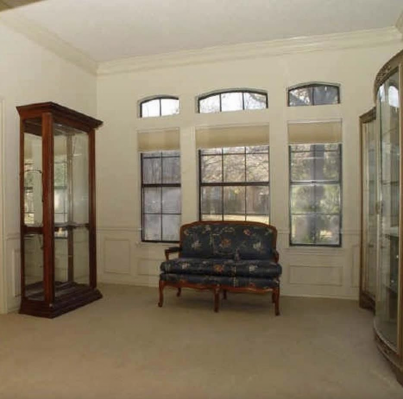
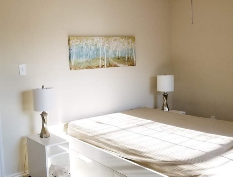
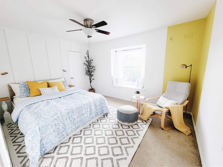
Anne's bedroom transformation is a great example of how adding pattern, dimension (the wall treatment) and a pop of color (that painted color-block in the corner is GENIUS) can make a huge impact in a space!
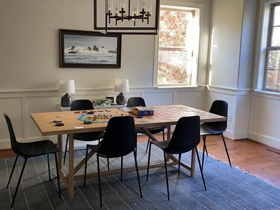
Tawnya NAILED her dining room makeover with the help of Designer in a Binder®. It just goes to show how much you can totally change a room WITHOUT changing any of your furniture!
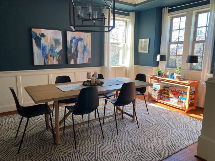
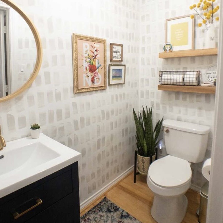
I literally gasped when I saw this half-bathroom transformation by Designer in a Binder customer, Brandy! She started with a blank slate and it would have been easy to install a run-of-the-mill bathroom, but Brandy went for something bold and colorful. And I loooooove it!!!!
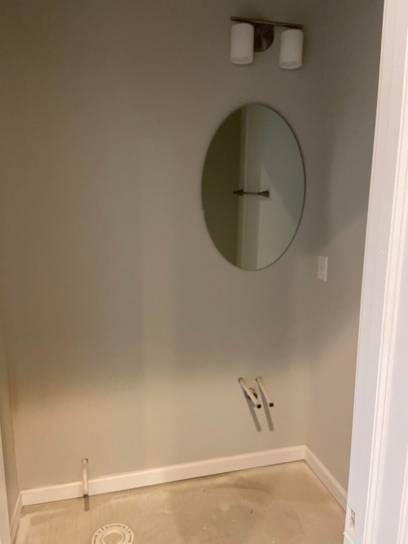
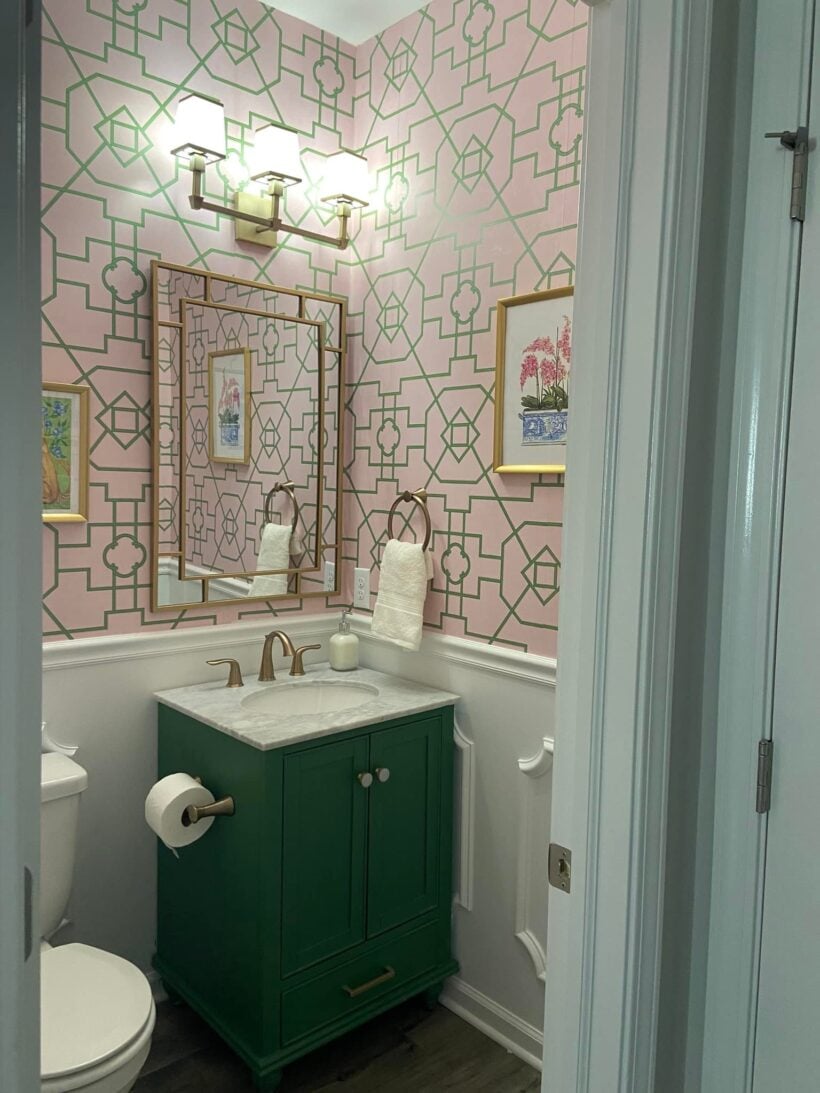
I'm a sucker for a good wallpaper and the one that Designer in a Binder® customer Christina picked for her bedroom is AMAZING! It's a great example of how color and pattern can completely transform a room!
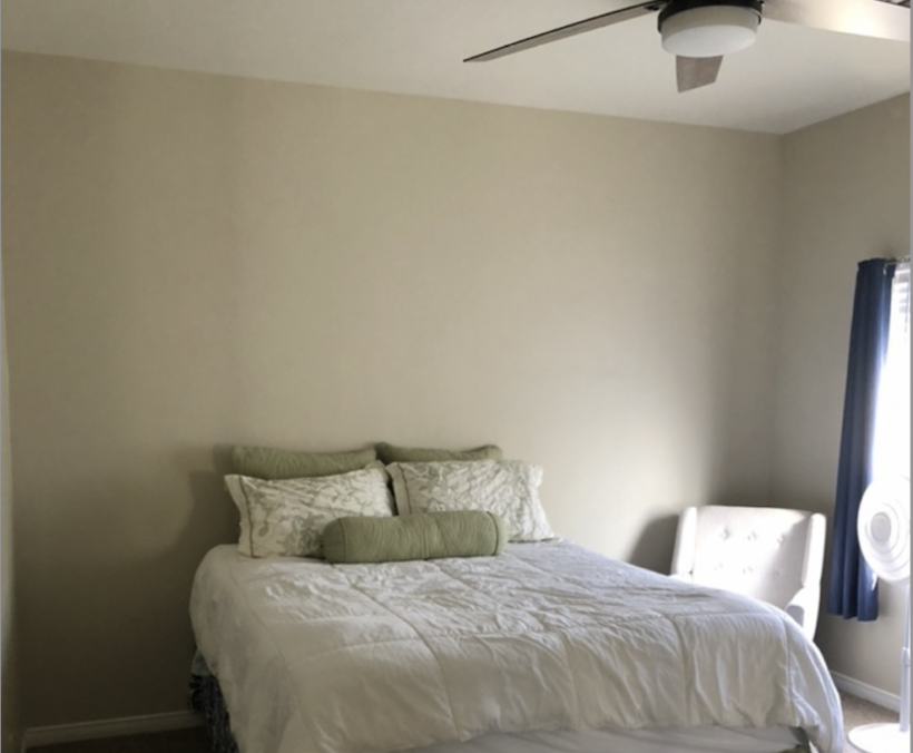
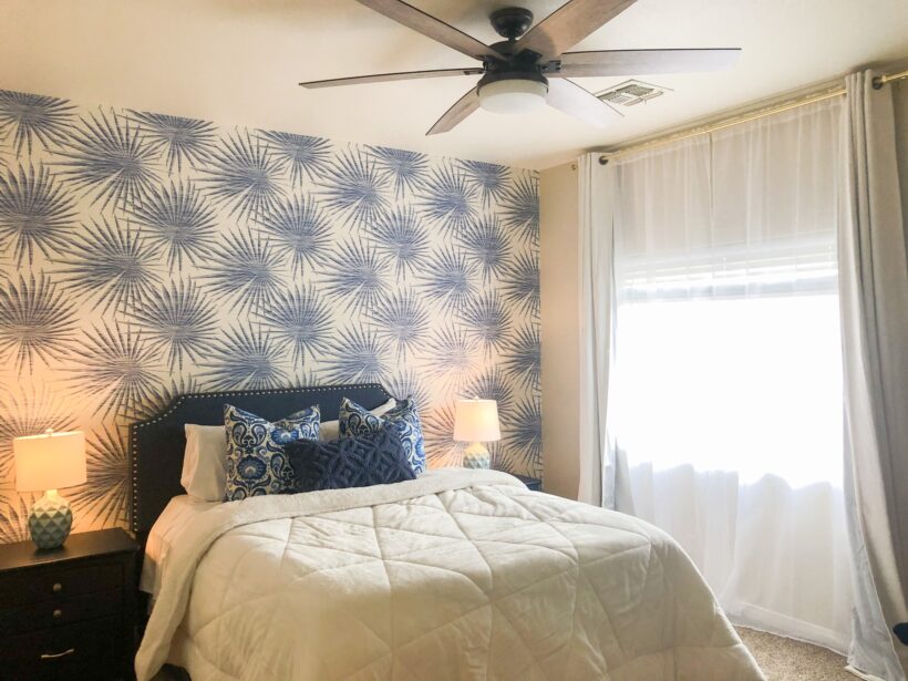
I adore the way Brooke brought color and life into her family room to give it a totally new look with the help of Designer in a Binder®. It's hard to believe it's the same space!
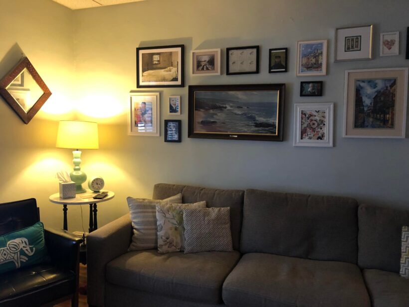
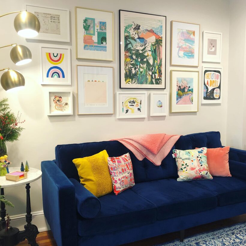
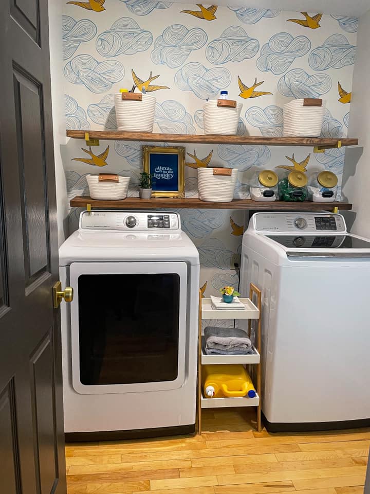
I love what Tracy did to add color and pattern to her laundry room with the help ofDesigner in a Binder®. She used one of my favorite wallpapers (you may recognize it in a different colorway on our dining room ceiling).
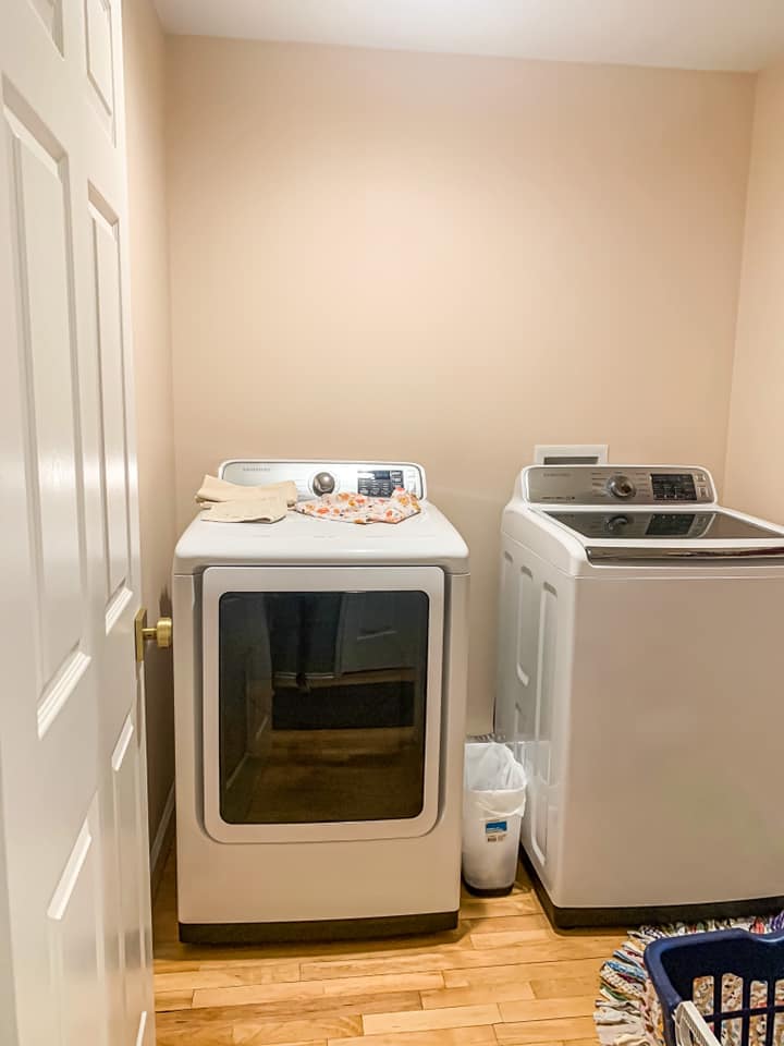
Cathy added peel-and-stick wallpaper in a really beautiful neutral print. She also created a board and batten look with wood boards, white paint and some caulk! Such an amazing DIY renovation made possible by her Designer in a Binder®!
Tracy hand-painted this pattern on her walls herself and it turned out amazing! With the help of her rug as her crucial element, she was able to choose decor that worked well together to create a warm and inviting space!
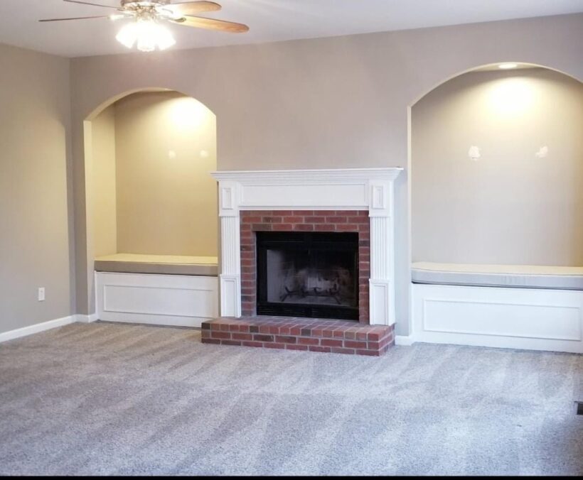
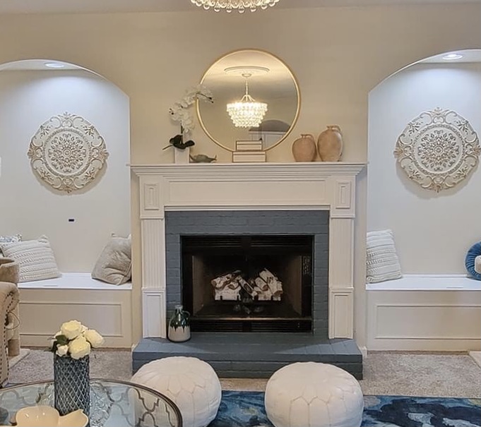
This week's transformation of the week shoutout goes to Carol. Carol wanted to transform her beige living room into one full of her favorite colors, blues and greens! With the help of Designer in a Binder® she chose her crucial element and was off the creating the space of her dreams. She decided to paint the fireplace to tie it in with the rest of the room. She used BM Providence Blue on the fireplace.
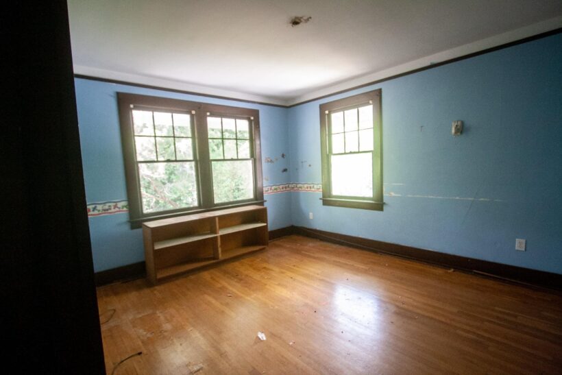
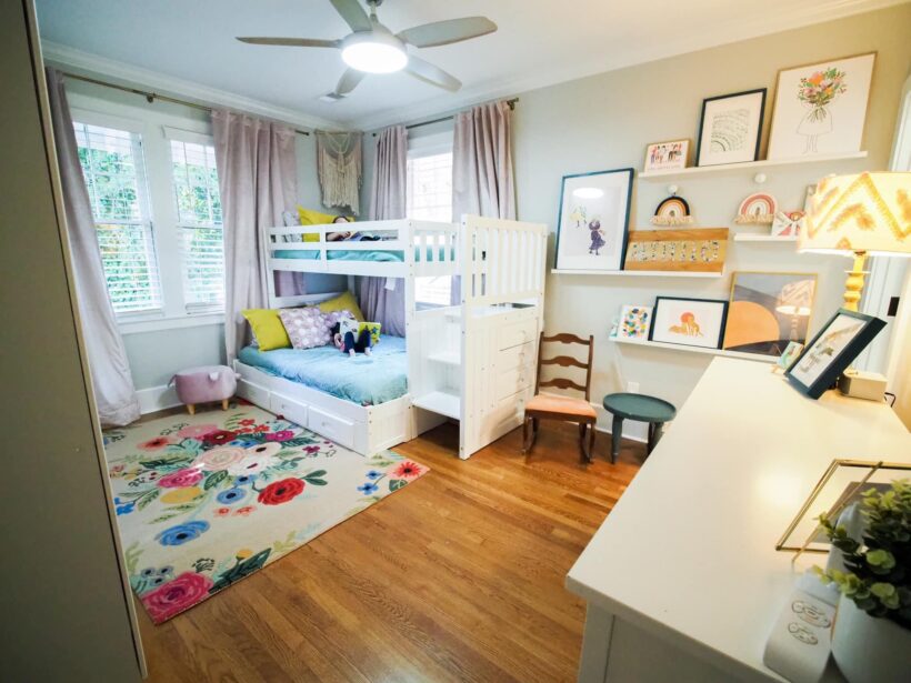
Bayne finally finished the transformation in her 3-year-old daughter's room and realized that girly girls are fun to decorate for!! The crucial element was the Rifle Paper Co rug from the Anthro outlet in Augusta, GA, and the goal was to include as much pink as possible in the design. This is another step toward finishing the giant (and lengthy!) project of renovating a 100-year-old house in downtown Columbia, SC.
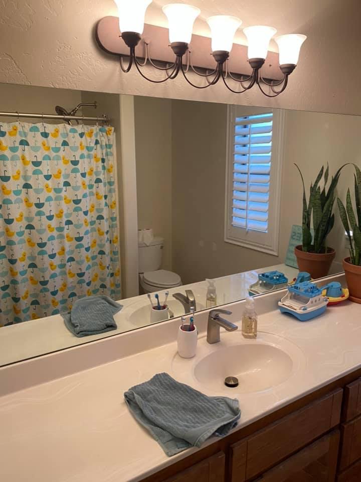
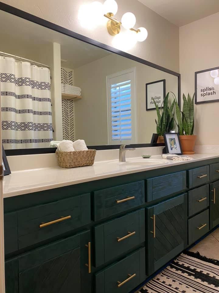
Kelly totally transformed her kids’ bathroom. She used my SUPER easy cabinet painting tutorial to paint her vanity cabinet, changed out the textiles and fixtures and made a simple DIY frame for the mirror. The frame was only $30 to make and she attached it with command strips so it will be easy to remove when they do a major renovation in the future.
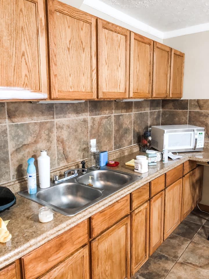
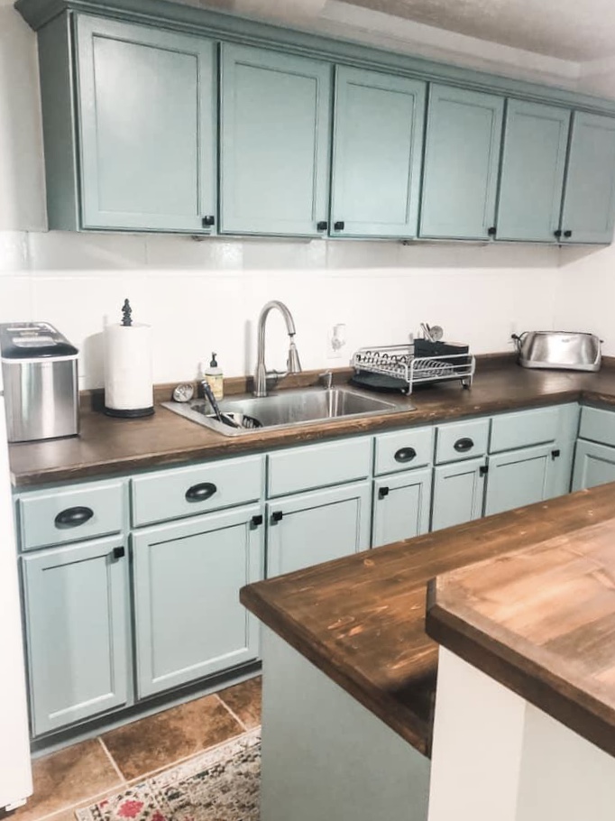
Kristen transformed this small kitchen for her college-aged kids! She painted the cabinets, added trim at the top. She also painted the backsplash and added butcher block countertops that she stained and sealed herself. Definitely an awesome DIY project!
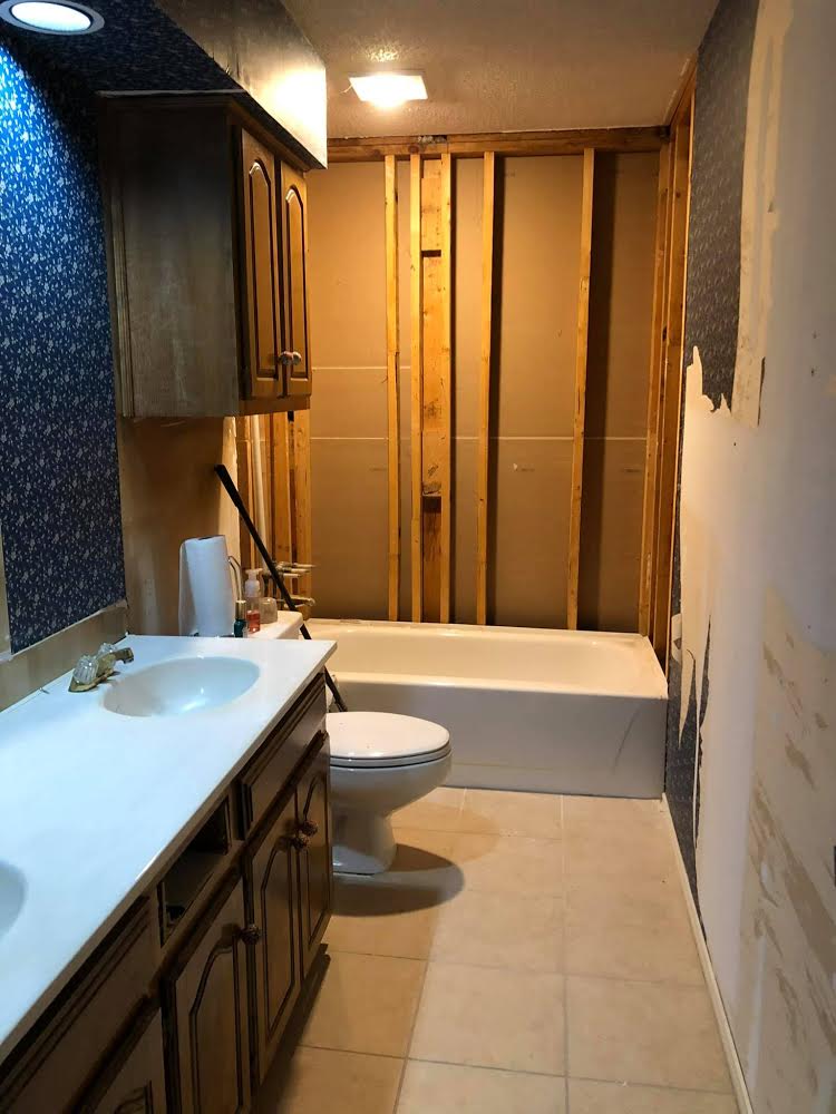
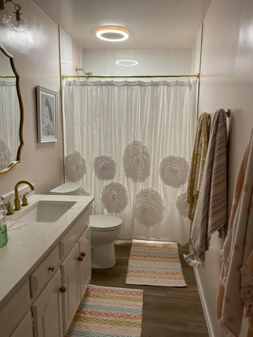
Ebby completed a gorgeous renovation for her girls' bathroom. Their bathroom had been untouched for about 7 years but they love it now! Ebby did all of this on a budget which including shopping her own home. The tub came from her guest bath and she painted her knobs and pulls to save money. The print was her crucial element and she kept it very feminine with the pinks for her all-girl household!
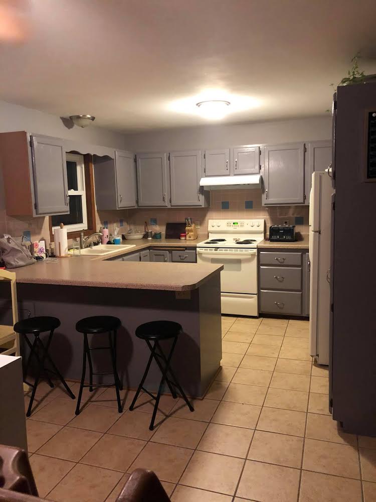
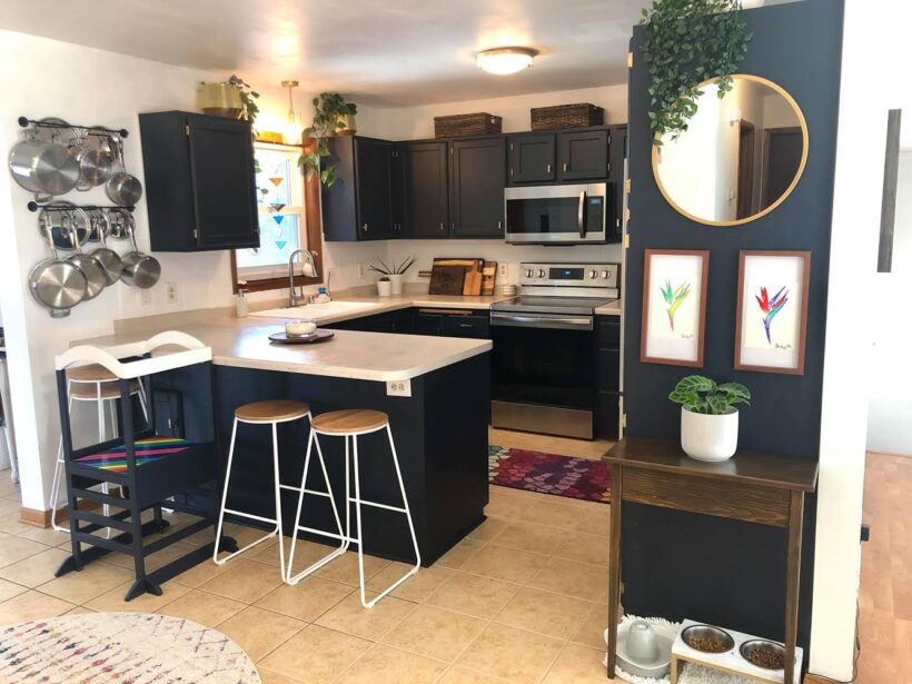
What an amazing budget-friendly kitchen update from Erica! The power of paint is real. She used Fusion Mineral Paint on the cabinets and backsplash following Tasha’s tutorial, a stain and poly coat from Fusion Mineral Paint for the table over the pet feeding station, countertop & sink refinishing kits. She and her husband did everything themselves, including adding the 3 new light fixtures! This update sure breathed life into an outdated kitchen!
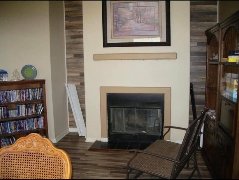
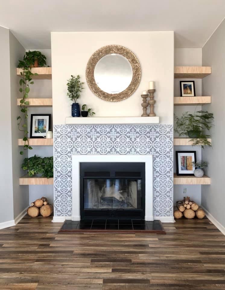
This before and after of a beautiful DIY fireplace is amazing! Lesli bought her home in September and has put so much sweat equity into it. It’s so amazing when a design plan starts to come together.
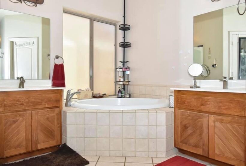
Kelly never made decorating her bathroom a priority, but once she did, she was so happy with the refresh! The bathroom cabinets are Fusion Mineral Midnight Blue following Tasha’s kitchen tutorial. What an awesome change from the way the bathroom looked in the listing photos to the beautiful oasis she created!
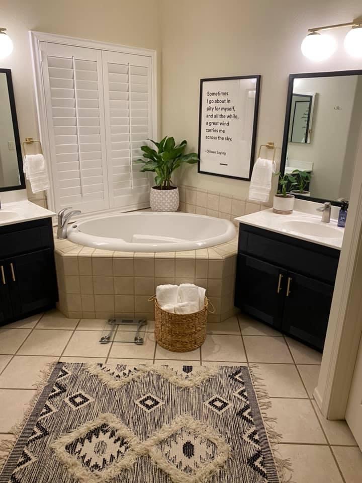
Laundry rooms are all the talk right now in my world since we just finished giving ours a pretty major glow-up. Today I am sharing a customer laundry room makeover that is gorgeous! With the help of Designer in a Binder and my tutorial from painting Thea's cabinets, Christina did a beautiful job on her laundry room. I love how fresh and light the new paint makes the space feel! Proof that a little a paint can make a HUGE difference.
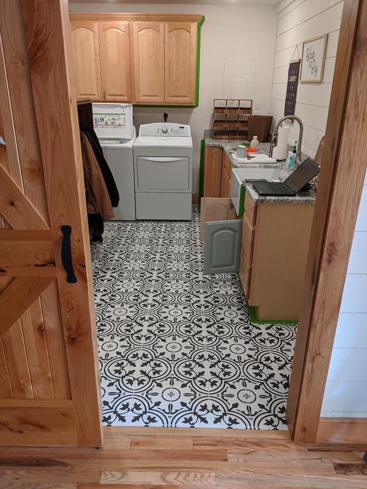
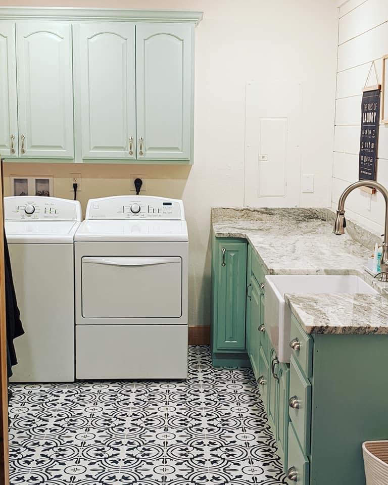
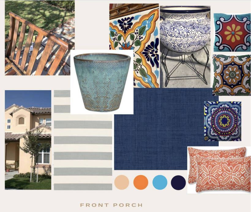
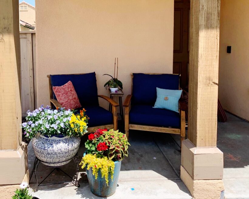
Since Summer is near and that has so many of us thinking about outdoor living, I wanted to share a customer patio transformation with you. With the help of Designer in a Binder Angie created this mood board for her front patio and then brought it to life! I love what she did!
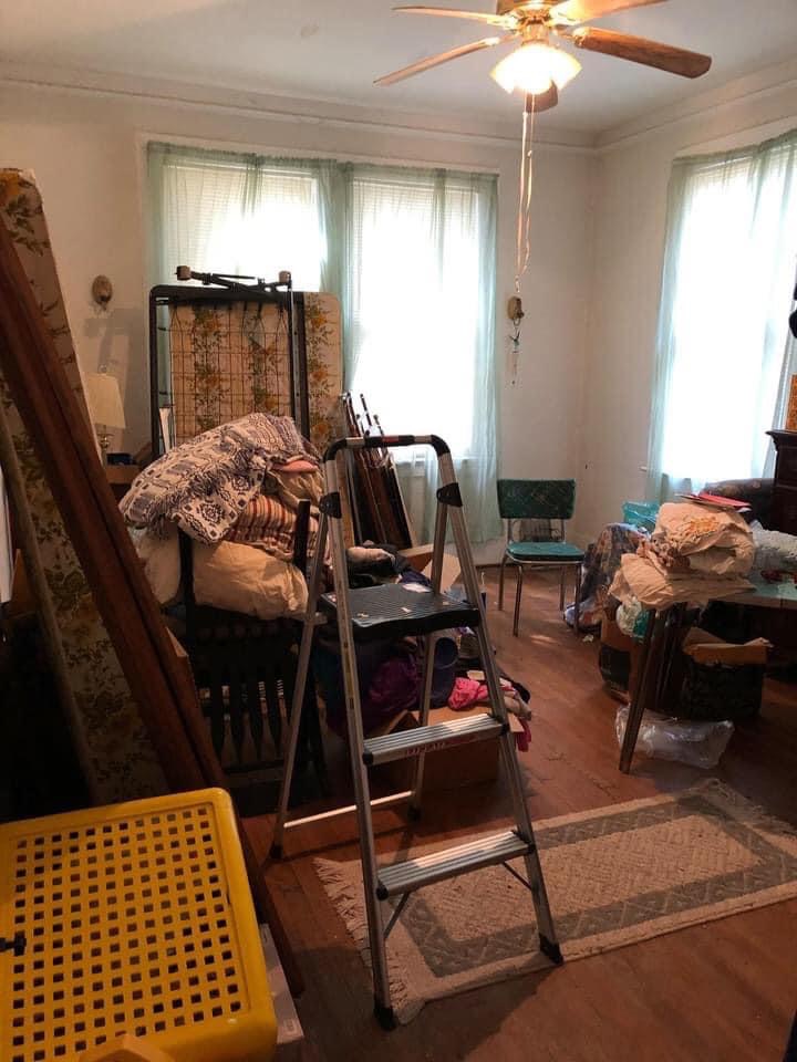
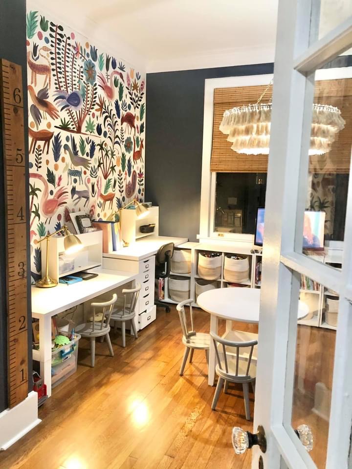
This playroom transformation by Bayne is one of my favorites! Talk about taking a room that was just being used for storage and transforming it into a beautiful and functional space.
We are so proud of and happy for every single one of our Designer in a Binder® customers who is using the simple system to create rooms that they love! You can click HERE to check out more customer transformations and reviews of Designer in a Binder®.
Wondering how I approach transforming rooms and spaces in our home? Check out Designer in a Binder®.
And if you want exclusive content and behind-the-scenes sneak peeks, be sure to subscribe before you head out!

