Design Challenges In Our Primary Bedroom
Not all room designs go smoothly! Our primary bedroom design has evolved over time, which has led to a few challenges. Learn what's working, where things went wrong and what I'm still hoping to change.
Hello there! If you follow me over on Instagram, you know that for the past few months I've been making some changes in our primary bedroom. Today I had planned on sharing a “reveal” post with you. But I can't do that because there's still quite a bit that isn't really working in this room. Instead, I've decided to walk you through what is working, what mistakes I've made and what I'd still like to do in here. You can find a source list at the bottom of this post.
The Purpose of the Changes I've Been Making
The goal of the changes I've been making over the past few months is simple. We want to lighten and brighten the space up. The room doesn't receive a ton of light because the screened-in-porch shades the one window in the room. So all of our dark navy blue furniture and decor that worked so well in the primary bedroom of our old house made our bedroom in this house feel dark and depressing.
The Changes I've Made So Far
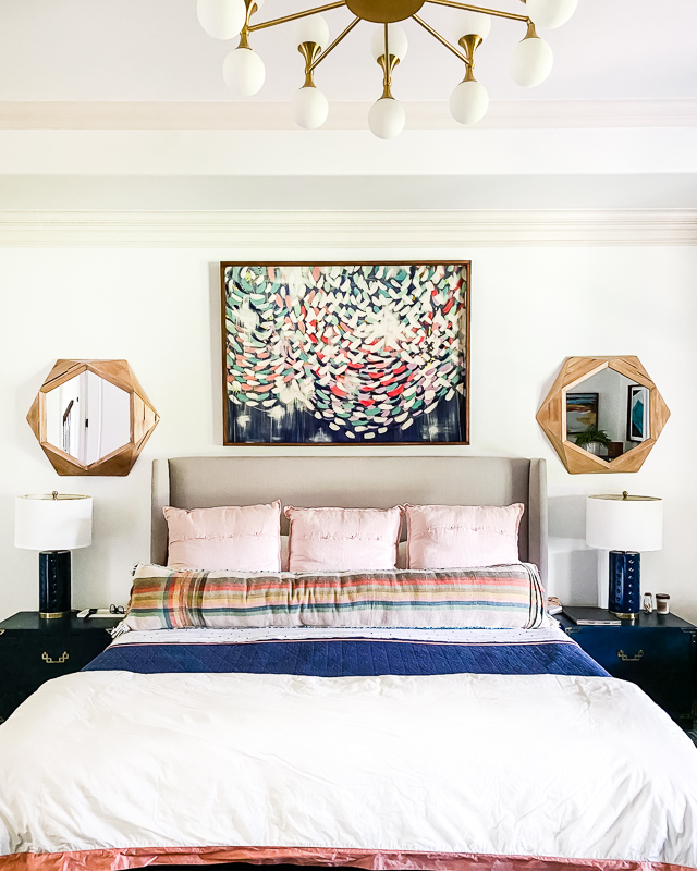
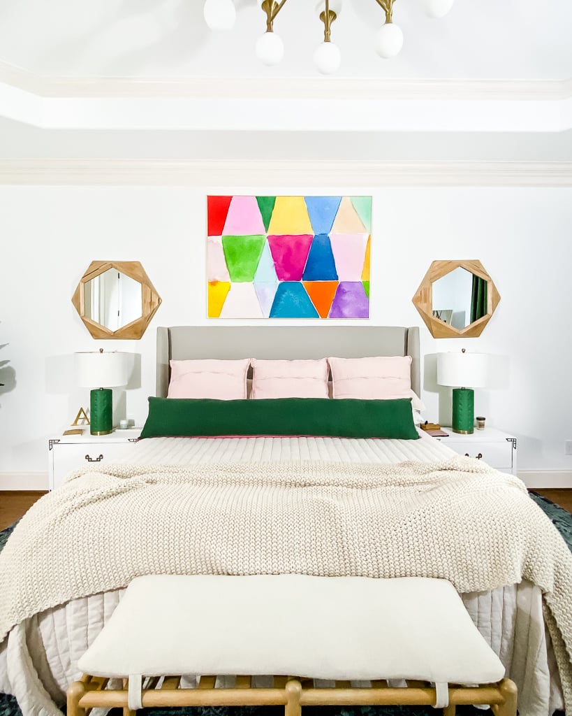
Many of the changes we have made were quick and easy. I painted the bedside tables and lamps. And I swapped out the art above the bed as well as the bedding.
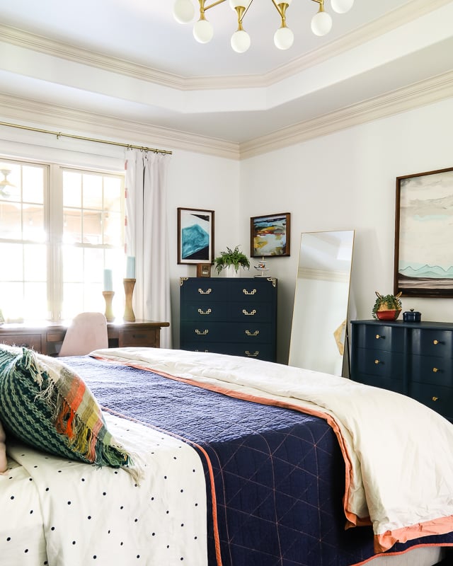
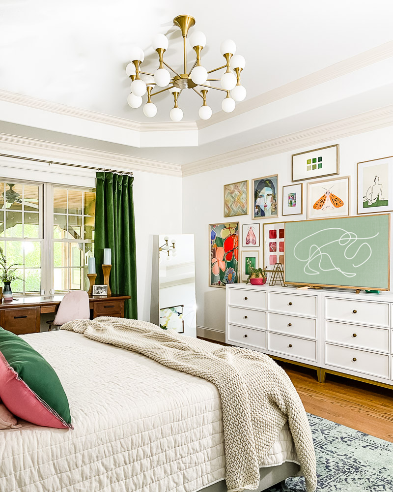
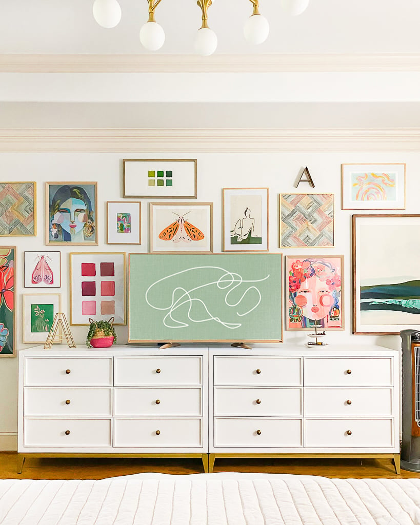
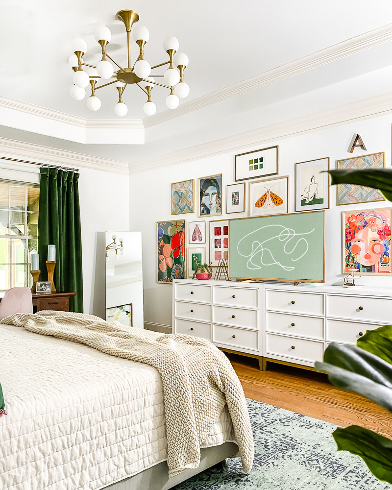
On the other side of the room, we swapped out the navy dressers (which we will now be using in our guest room) for two white dressers. I love that when placed side-by-side they look like one large piece of furniture. We also moved our old family room TV in here and used it as the anchor point for this whimsical and colorful gallery wall. You can see how I made our very basic TV look like a frame TV in this post! And I swapped out the cream color curtains (that we slapped up because they fit, lol) for bold green velvet curtains.
What's Working and What's Not
All of the changes that we've made so far are working. I love the pops of green and pink so much. And the gallery wall gives me life. The lighter neutral bedding is exactly what I wanted!
But there are several things that aren't working. First of all, there's no clear “color hero” in the room. That's a problem. Let me explain…
There was no question that blue used to be the color hero in the room. And I want green to be the color hero in the room now. But it isn't. Not yet. Part of the problem is the rug. I LOVE this rug (so much that we also have it in our entryway and in Avery's room) and it worked beautifully when our room was predominately blue. But now that the room is dominated by green and pink this blue rug doesn't make sense. I've been on the hunt for a rug that will work better, but I haven't found one just yet. I think once I find a rug with green in it and add some more green art or accessories to the room, green will be the clear color hero and the color balance will feel good again.
The other thing that is just not working is the desk. I actually like the size and placement of the desk, but it's just too dark for the space. That said, this is not a piece we will ever get rid of or paint. It's the first piece of “real” furniture Joe and I purchased together so it's sentimentally important to both of us. So, we will find somewhere else for it in the house.
Where Did Things Go Wrong?
I can tell you exactly where things went wrong. I've made little changes over time. That means I never sat down and created a design plan for this space which is what I usually do. In fact, that's EXACTLY what I teach people how to do in Designer in a Binder. The most important step in my design process is choosing what I call a “crucial element.” I didn't do that before I started making these little changes. And it shows. That's why I've wound up with a color palette and no clear color hero.
Not to worry! Everything can be fixed. But it just goes to show that in my experience, it's always better to flesh out a design plan before actually making changes. I knew better. Sometimes life is more conducive to slow, small design changes. But that doesn't mean I shouldn't have thought through the overall design goal and plan first. Learn from my mistake.
The Good News
I'm not in a big rush to finish this space. I know what needs to happen and I can patiently hunt for the right rug and accessories to finish this room off perfectly. It will also give me time to sell the old rug to help pay for a new one, etc. There's absolutely nothing wrong with design taking time. I just wish I'd thought through this space more before I started making changes.
That's it for now. If you see any pretty rugs you think would work in here, send them my way!
Source List
You can find sources for what you see in our bedroom below. I've linked as many things as possible (some things are too old or are second-hand and cannot be linked–sorry). Click on any image for full product details.
And if you want to learn more about Designer in a Binder which is the process I should have used to design this space, you can see reviews and client before & after transformations on the sales page!
Last Updated on March 3, 2022

Your bedroom is beautiful! Thanks for sharing. I’m also doing a bedroom with little natural light that includes green and pink accents. Can you tell me what paint color and brand you used on the walls. Thank you
Hi Tricia! We used Sherwin Williams Pure White :)