Beautiful Blue Paint Colors Designers Love & Use
Blue is one of my absolute favorite paint colors to use on walls, cabinets and more. Why? Because blue can be used as a neutral in your home! Think about it… blue jeans go with pretty much everything, right?! But blue is a more interesting and better neutral choice for color-lovers like myself :)
But picking the perfect blue for your walls can be overwhelming. These popular blue paint colors are handpicked by designers. From blue-gray paint colors to vibrant hues, there's blue paint for every aesthetic!
If you have been around here for any amount of time, you know that blue is a foundational color in both our current home and in our old home. We have used different hues of blue in so many different ways. I LOVE blue and consider it to be an awesome neutral. If blue jeans go with everything, so do blue walls!
We have used blue paint colors ranging from vibrant blue when we installed this DIY modern plank wall in our old house to the dark navy blue dining room in our current house, and everything in between. The spectrum of blue feels never-ending! Don't be afraid to step outside the box and take chances when you are testing out different blues for your home.
Need help choosing the perfect blue paint color for your aesthetic and style? Help is here! I have broken down my top designer favorites by category: blue gray paint colors, dark blue, vibrant blue, and blue-green. Looking at how professionals use their favorite blues can help inspire you to choose the right blue for your walls.
I've included the color number and light reflective value of each color for you as well. LRV, or Light Reflectance Value, measures the percentage of light reflected from a surface. LRVs range from 0-100, with 100 being pure white and 0 being absolute black. The higher the number, the more light the color reflects.
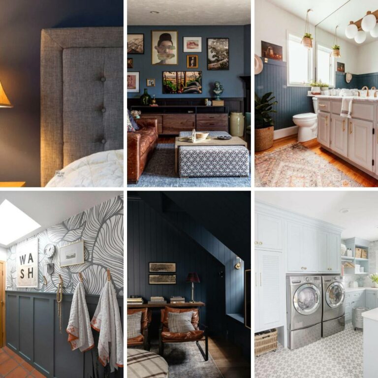
Blue Gray Paint Colors
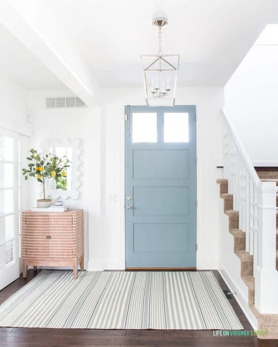
Water's Edge by Benjamin Moore (1635) LRV 31.48
This foyer is a breath of fresh air. The blue-gray front door painted Water's Edge by Benjamin Moore is a fun pop of color while still feeling neutral. The gray in this shade keeps the blue from feeling too overpowering!
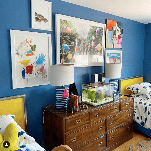
Adirondack Blue by Behr (N480-5) LRV 23
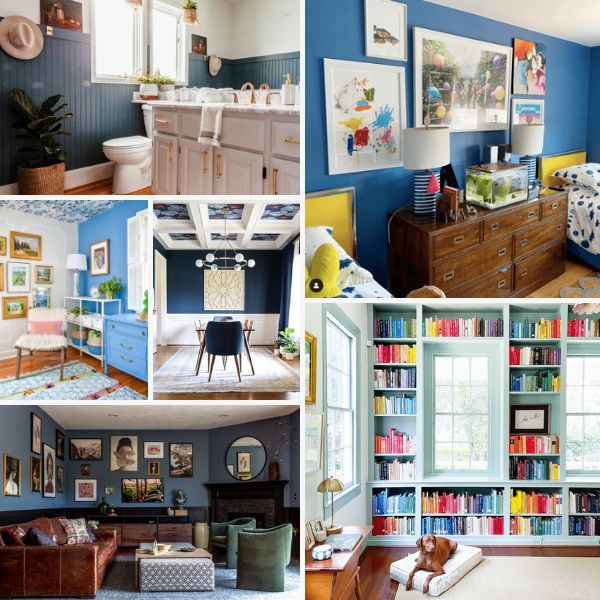
Grayish-blue can feel farmhouse, but paired with black wainscoting it feels elevated and sophisticated. Brianna used Behr's Adirondak Blue, then hung an amazing gallery wall, and used modern decor for the perfect modern traditional design.
Waterloo by Sherwin-Williams (SW 9141) LRV 13
The gray undertones in Sherwin-William's Waterloo make it feel crisp and it looks beautiful paired with natural woods and whites. It is the perfect blue for a little depth and color but it doesn't feel too rich or heavy.
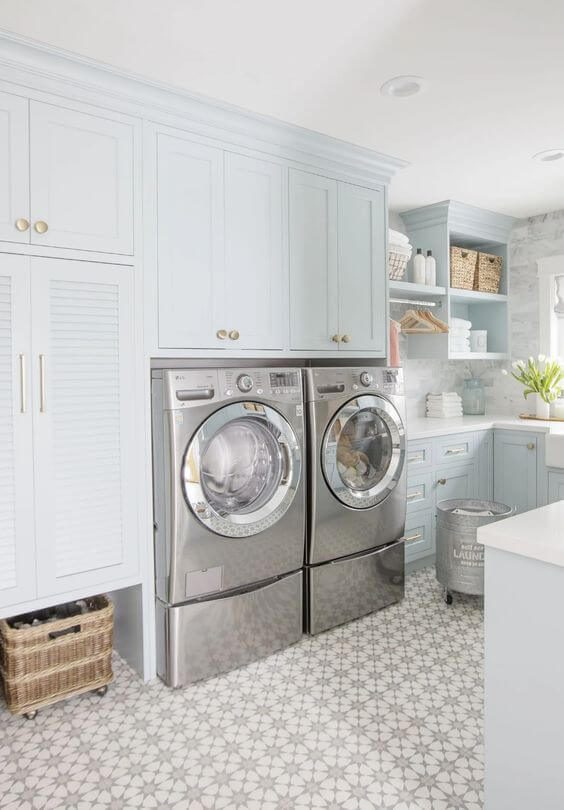
Smoke by Benjamin Moore (2122-40) LRV 56
Jillian is the first to admit she took a gamble painting all the cabinetry in this laundry room with Benjamin Moore's Smoke. This extremely pale blue with a touch of cool gray is gorgeous and a great choice! It feels super neutral without being just traditional white. Seeing how perfectly it pairs with the brass pulls and gorgeous tile it is safe to say she picked a winner!
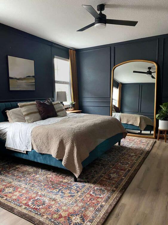
Ink Black by Behr (N490-7) LRV 7
Looking for a moody dark blue with just a touch of gray to soften it? Behr's Ink Black is the perfect choice (and it really is dark blue, not black as the name suggests). Amanda created a calming vibe in her bedroom, setting the mood for sleep and relaxation.
Dark Blue Paint Colors
Midnight in the Tropics by Behr (S480-7) LRV 7
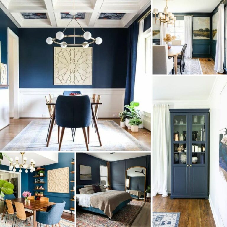
When we did a total kitchen renovation in our old house it opened up our dining room and we used it as an opportunity to create the eclectic navy dining room of my dreams! I chose Behr's Midnight in the Tropics for the walls. It was the perfect dark blue for us–lots of depth and a tiny hint of green, and it was beautiful in the natural light from our windows. Not to mention it looked amazing against all the white trim.
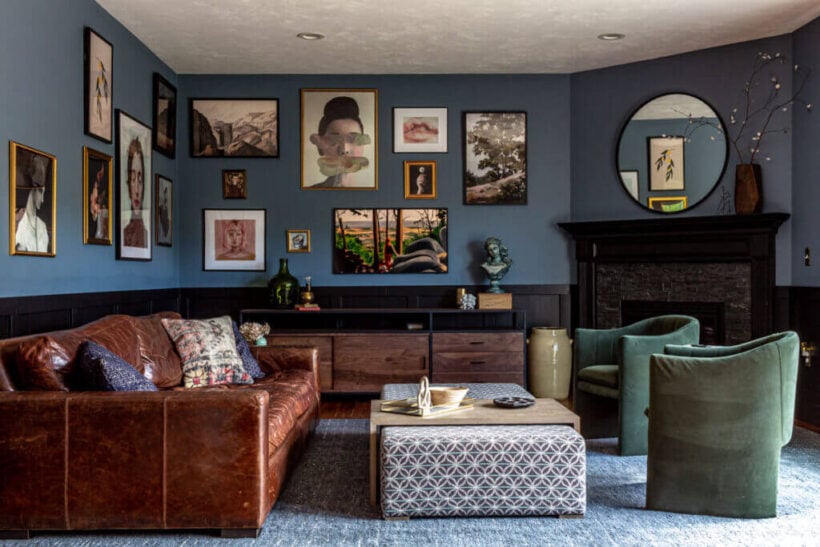
Polo Blue by Benjamin Moore (2062-10) LRV 5.6
Dark moody blue walls got an upgrade by Brianna with a stencil in light blue. I love the sense of calm Benjamin Moore's Polo Blue creates in the designer's bedroom. Perfect for a sanctuary! And the stencil over it brings an unexpected lighter element keeping it from feeling too cave-like.
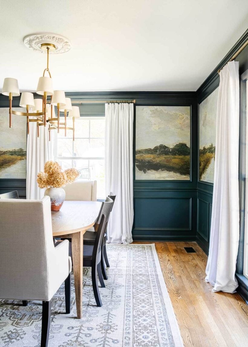
Blue Ridge Parkway by RomaBio Mineral Paints
Lauren gave her dining room walls a complete upgrade with beautiful dark blue paint (RoomaBio's Blue Ridge Parkway), peel-and-stick landscape murals, and molding. The finished product is a gorgeous high-end designer look. The mural and paint work together beautifully to create a stunning and dramatic makeover!
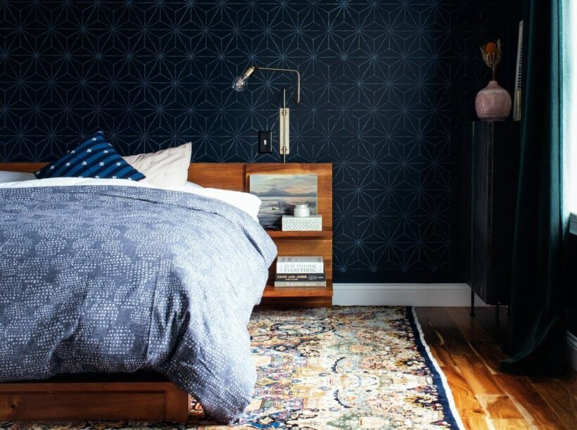
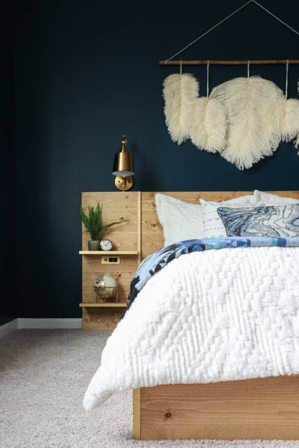
Moscow Midnight by Sherwin-Williams (SW 9142) LRV 5
Zoe at Pine and Poplar chose Sherwin-Williams' Moscow Midnight as the contrasting backdrop to the wood tones in her decor and bed. The natural wood pops perfectly against the deep tone of the blue. This dark dark blue has a lux look, almost like velvet! Perfect for a cozy cave-like bedroom.
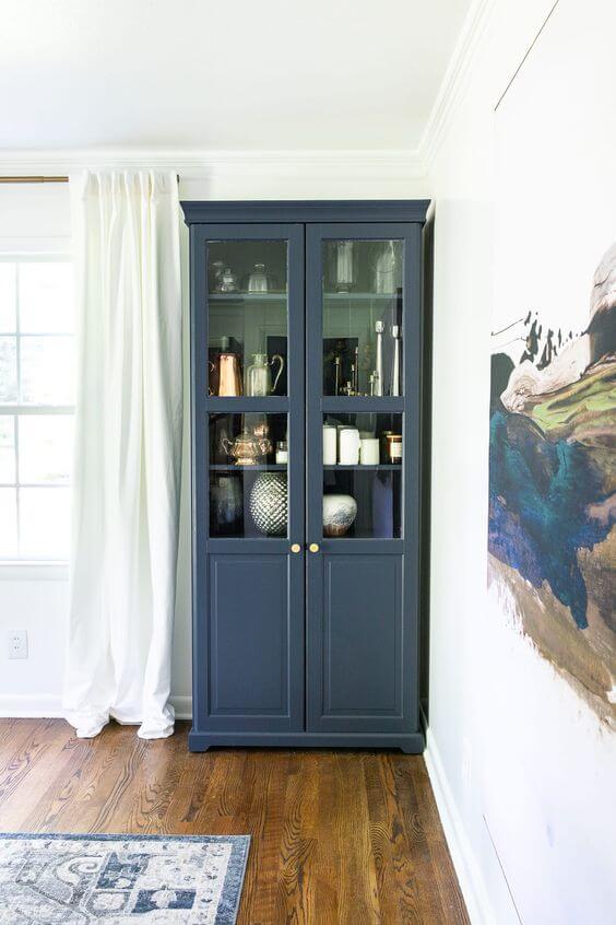
Hale Navy by Benjamin Moore (HC-154) LRV: 6.3
Navy isn't just for walls! Lauren used Benjamin Moore's Hale Navy on her cabinet in her dining room to give it an upgrade. The versatility of IKEA furniture can't be beaten, and there are tricks for painting laminate furniture that make it easy. This navy, softer with gray undertones, brings out the shades of blue in the art and the rug.
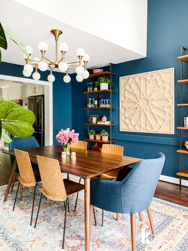
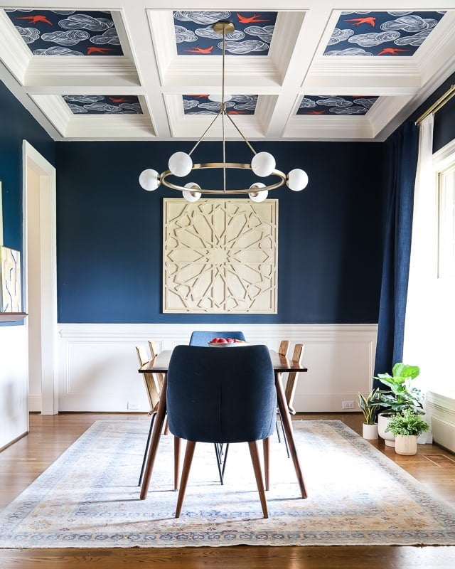
Gale Force by Sherwin-Williams (SW 7605) LRV 6
When I painted our navy blue dining room in this house, I wanted a rich deep true navy. We grabbed paint samples and tried several hues, and Sherwin-Williams' Gale Force was the winner! It is a gorgeous dark blue with the depth I wanted for this room.
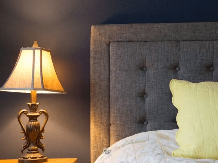
Indigo Batik by Sherwin-Williams (SW 7602) LRV 8
Sherwin-Williams' Indigo Batik is a lighter navy so it is a great go-to if you want your entire room a dark blue but are nervous to go really dark. It still provides plenty of contrast but doesn't feel quite as dramatic as some of the darker blues. I love it with the gray of the headboard.
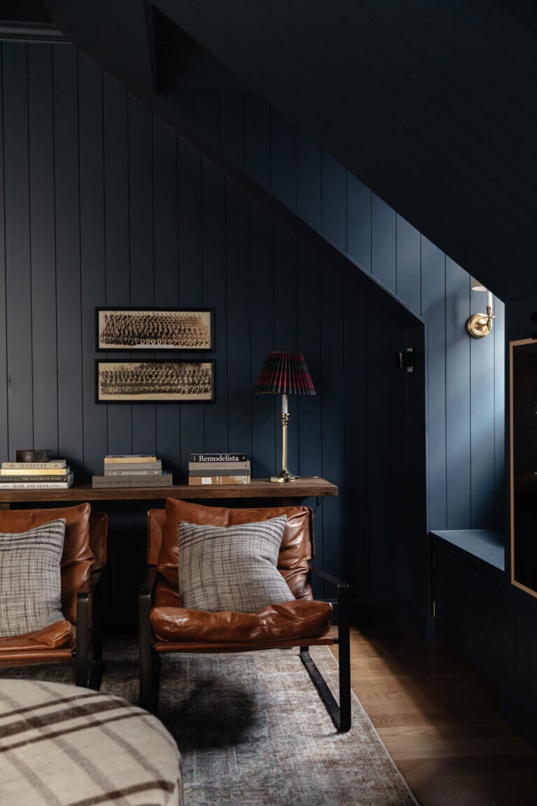
Stiffkey Blue by Farrow and Ball (281) LRV 10
Farrow and Ball's Stiffykey is dark and moody in all the right ways! Chris Loves Julia went for it and painted every inch of their bonus room this rich navy, even the trim and ceiling. It highlights the architecture of the paneling, dormers and window nooks, and ceiling. This daring design choice of rich blues and neutrals everywhere else really paid off!
Vibrant Blue Paint Colors
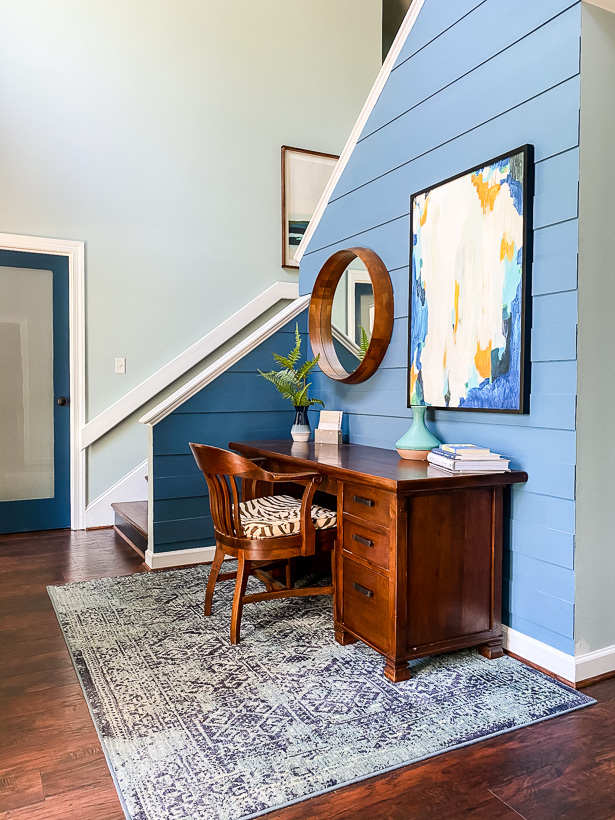
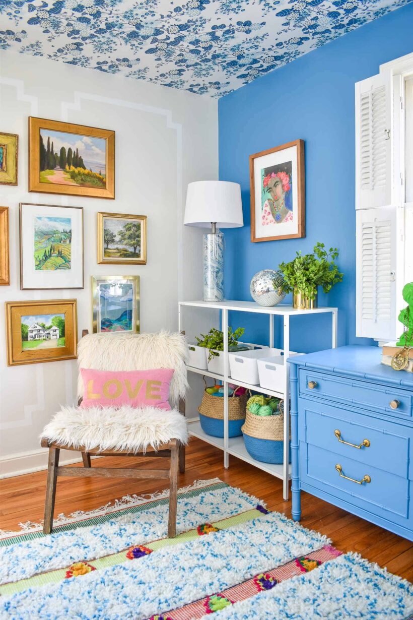
Blueprint by Behr (S470-5) LRV: 20
Behr's Blueprint is one of my favorite blue paint colors. I love how it brightened up our old foyer and the hue is perfect! We got a ton of natural light right there and the vibrant blue of the modern plank wall and white trim really made the foyer sing. I am still looking for the perfect place to use Blueprint in this house!
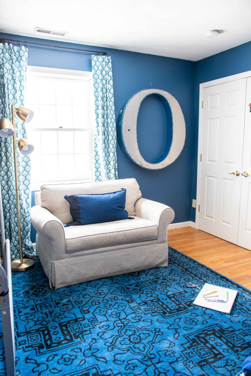
Hyperlink by Clare
It can be tricky finding the right blue for a boy's room that doesn't feel too much like a primary color. Clare's Hyperlink strikes the right balance of blue without looking like a crayon. Charlotte used it in her son's room and elevated it even more with cool interior design elements that are still kid-friendly.
Ultra Marine Blue by Farrow and Ball (29)
Ocean blue but make it high style! Blue may be traditional for boys, but Camilla takes Farrow and Ball's Ultra Marine bedroom up a notch by adding in tons of color pops to create a dream kids' room! It is a gorgeous vibrant blue that feels bright and rich at the same time.
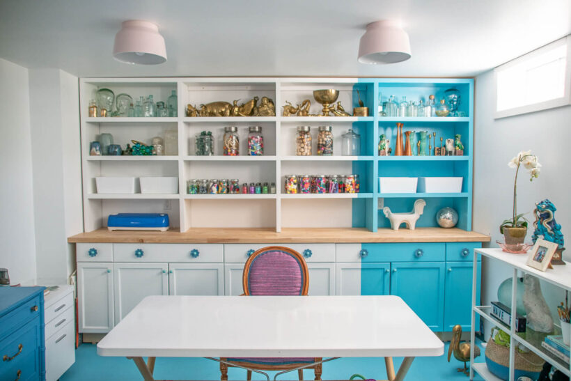
Custom Mixed from Leftover Paint
Can't find the right thing? Sometimes you have to mix your own! Charlotte created her office from scratch, including the paint color. She tried to buy the right thing but didn't like it, so she added in some dark and landed on this fun bright blue that quite literally brightens up the space! She used it on the floor and then continued it up the built-ins to create a very cool offset section.
Jet Ski by Behr (M490-5) LRV 26
Charlotte is a pro at designing layered spaces that are interesting and fun. She chose Behr's Jet Ski as the perfect vibrant blue for her accent wall. It is a lighter shade of bright blue that still has a lot of depth and pigment, and she also used similar lighter blues in her decor to make the design feel cohesive.
Blue Green Paint Colors
Midnight in NY by Behr (N440-7) LRV 10
With no windows in a room, it may feel like a bold choice to paint a dark color like Behr's Midnight in NY on the walls. However, the white trim, light carpets and mirrors balance this rich and moody greenish-blue and keep the room from feeling like a cave. It is a gorgeous deep color that works well with light neutrals and blacks!
Wythe Blue by Benjamin Moore (HC-143) LRV 48
Benjamin Moore's Wythe Blue appears to be a blue-green chameleon! This soft blue-green is somewhere between a very pale watery blue and a light aqua-teal, depending on how the light in your room hits it. I had high hopes it would look like this in my house, but it looked very sad and not at all what I wanted! I love it here–the green really shows through. Make sure to try large swatches in a few parts of your room to make sure it will read the way you want!
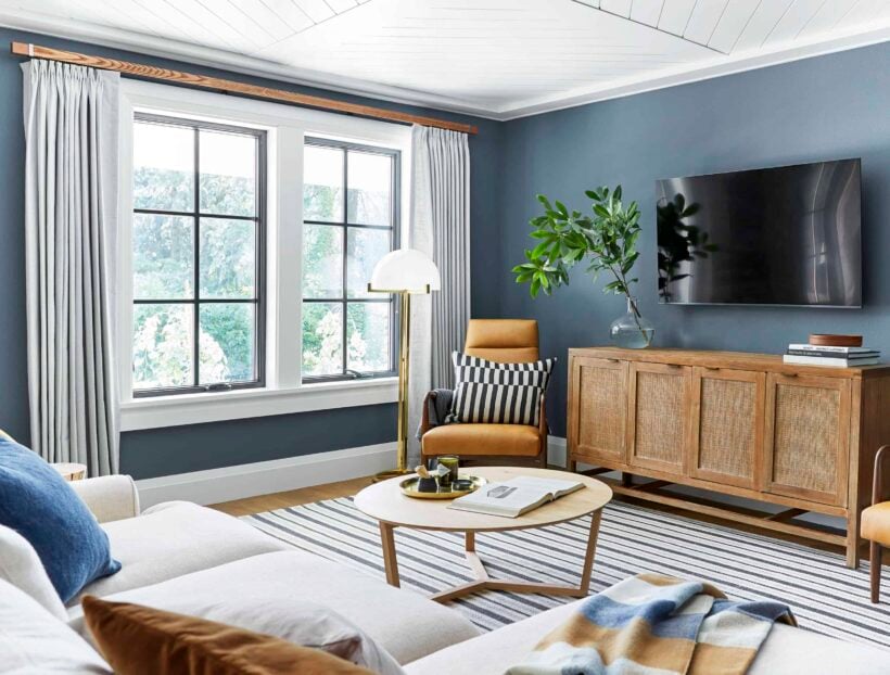
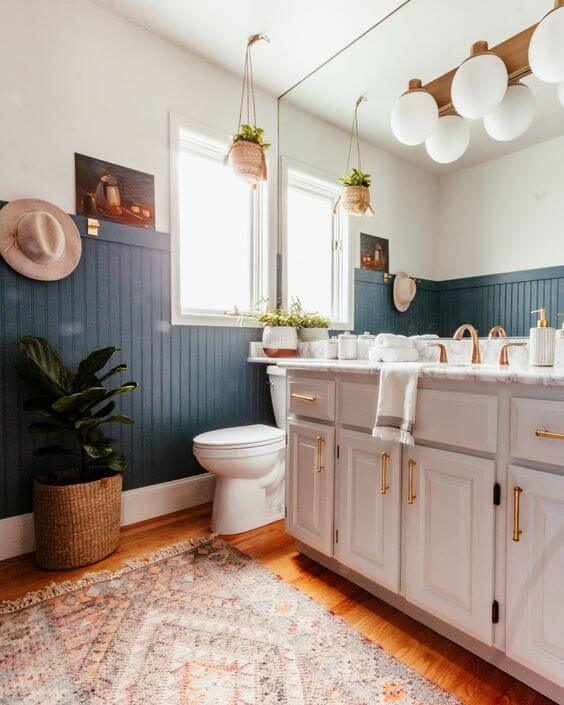
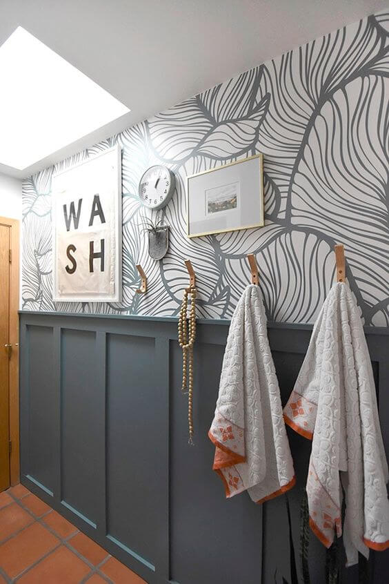
Smoky Blue by Sherwin-Williams (SW 7604) LRV 15
Almost a dark teal, this moodier blue color has a smoky green undertone. Sherwin-Williams' Smoky Blue is a great dramatic color and looks beautiful in this bathroom creating the perfect backdrop for the whites and neutrals!
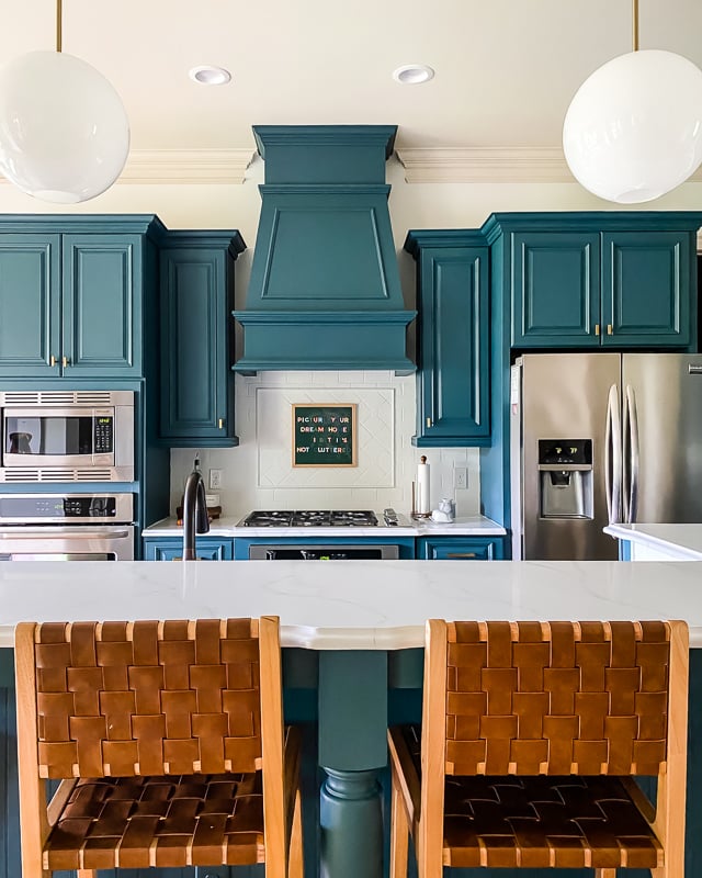
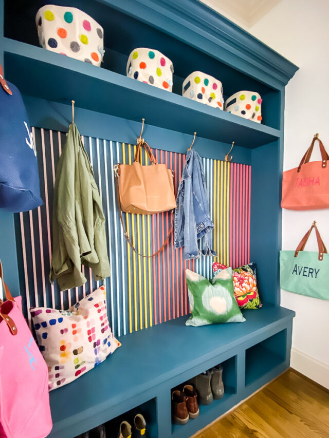
Seaside by Fusion Mineral Paint
I get asked all the time about what color we used for our cbinets when I tackled our budget-friendly kitchen makeover. It's Seaside by Fusion Mineral Paint (you can save 10% with coupon code AFFMP10 at checkout!). I love it so much I also used it on the built-ins in our mudroom–it's such a beautiful backdrop to the colorful DIY slat wall treatment I added to it.
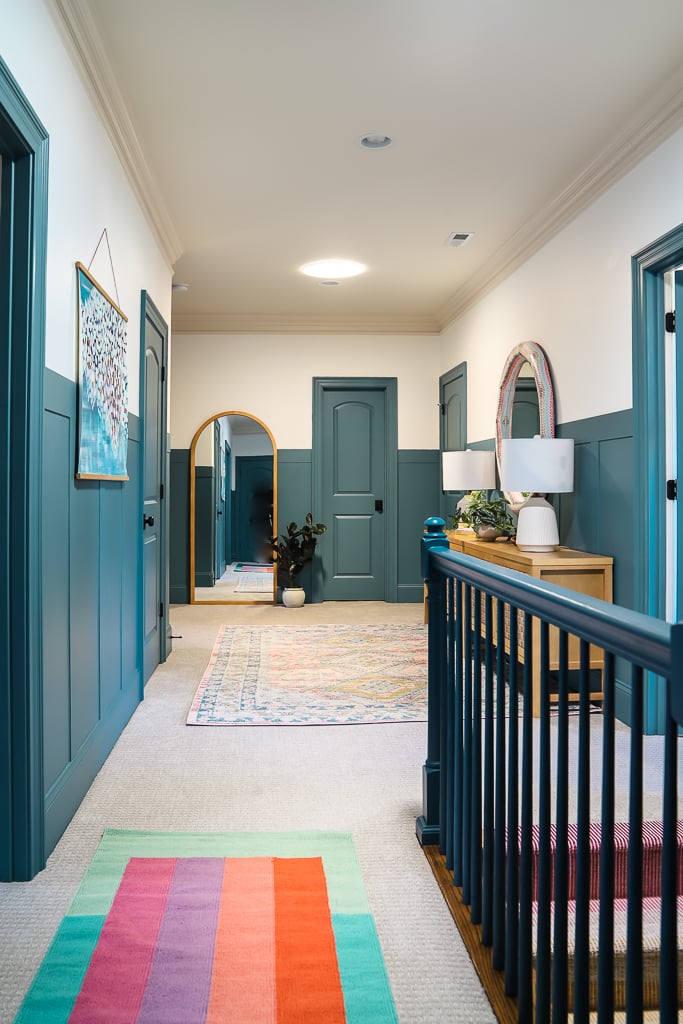
Refuge by Sherwin-Williams (SW 6228) LRV 19
We recently added DIY board and batten in our upstairs hallway and I knew I wanted to paint it a pretty blue-green color. We tried several hues in the blue family before settling on Sherwin-Williams' Refuge. It strikes the perfect balance of blue and green for me and I love that it feels clean and fresh.
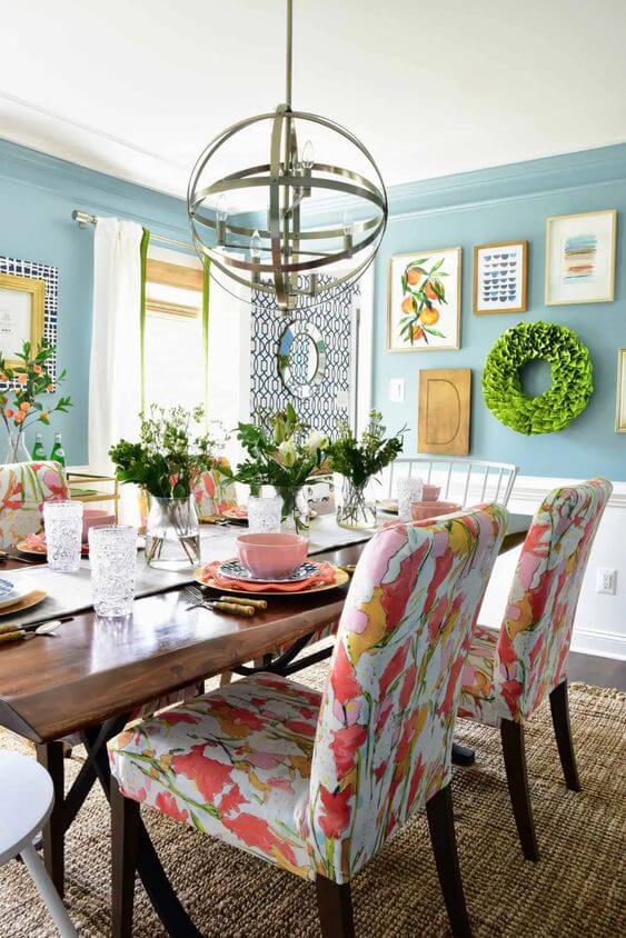
Summer Friday by Clare
Kate gave her dining room a preppy botanical makeover and choose Clare's Summer Friday for the walls. She wanted it to feel like springtime, and the beautiful teal blue walls are the perfect backdrop for that! The beautiful color holds its own with the art and pattern in the room, while not overpowering it. Sky blue with a hint of green, I love this color for a light-airy look!
Dragonfly by Behr (PPU12-03) LRV 26
This gorgeous teal color was a trending color for Behr in 2020, and matched Amy's wallpaper perfectly. The boho and earthy vibe of Behr's Dragonfly worked beautifully with the terracotta color of her tile, which had to stay.
Don't these designers have you feeling inspired with their beautiful blue paint options? There are so many gorgeous shades out there–from barely-there blues to inky midnight navies, and everything in between. Adding blue to your decor will bring a sense of calm and give you another great option for a neutral.
You can also get daring about how to use your favorite blue! We did our own DIY painted kitchen cabinets blue, painted our front door blue, and in our old house all of my interior doors were painted navy. These were some of my favorite upgrades to the look and feel of our home. Blue is so versatile–you just have to choose the right one for your style and design.
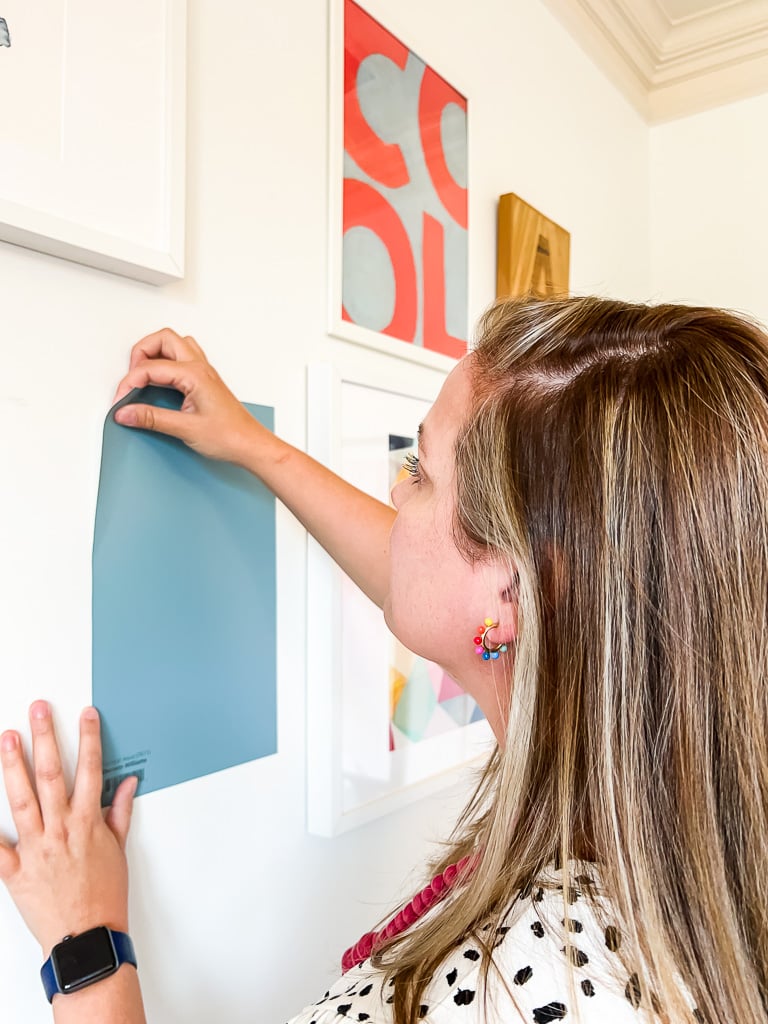
Before picking one of these blue paint colors, please check out How to Choose Paint Colors for Your Home: 6 Simple Tips to Follow! One of the most important tips I share is to TEST every paint color you are considering in your own home first! Look at it on every wall and in every light. If you want an easy way, try my favorite peel and stick paint samples. You can also buy small sample pots. In the end, you will save yourself tons of heartache, stress and money by trying it out first. Learn from my mistakes–I have rushed and bought paint without trying it. I once repainted my kitchen three times. Just because a designer picture looks amazing, doesn't mean it will look like that in your house with your furniture and your lighting. Try before your buy!
More Paint Posts
Other posts you may enjoy:
- A Paint Sheen Guide & Reference Chart
- 5 Tips to Decorate With Color (Even When It Scares You)
- How to Choose Paint Colors for Your Home: 6 Simple Tips to Follow
- How to Match A Paint Color That's Already On A Wall
Wondering how I approach transforming rooms and spaces in our home? Check out Designer in a Binder®.

And if you want exclusive content and behind-the-scenes sneak peeks, be sure to subscribe before you head out!