8 Interior Design Mistakes You Don’t Even Know You are Making (and How to Fix Them)
Are you making any of these interior design mistakes without even realizing it? Most people are! But don't worry… these decorating mistakes are easy to fix with these easy to follow interior design tips.
It happens to the best of us. You are in HomeGoods and you see a gorgeous lamp and you snap it up. You think it will be perfect in your bedroom. You rush home and are super excited to put it on your nightstand and see just how perfect it looks. But when you do, you realize it's all wrong. It's too small and it just kind of fades away into the background. Sigh.
Now you dread having to find the time to take it back to the store and stand in the return line when you are already so busy it's hard to find time to sleep. Not good.
But where did you go wrong? It looked absolutely perfect in the store! The fact is that you probably went wrong at the very beginning of working on your space. Why? Because to really nail a beautifully designed room, you need to create a cohesive interior design plan before you ever buy a single item. But most people just start buying stuff they like and that “matches” and try to pull it all together. That rarely works.
A cohesive design plan requires pre-planning and thought about the color palette, lighting, room size, scale and furniture placement. Sadly, these are steps that most people skip (which is exactly why I created Designer in a Binder ). Knowing and avoiding the most common interior design mistakes will help you tremendously as you work to create a design plan for any room or space in your home. So in this post, I'm going to walk you through the 8 most common interior design mistakes as well as how to fix them.
The Biggest Mistakes People Make When Decorating + How to Fix Them
Decorating Mistake No. 1: Your home is full of clutter.
Many people make the mistake of trying to decorate their home around their clutter. That just doesn't work. By definition “clutter” means “a crowded or confused mass or collection.” Y'all, a crowded or confused mass of stuff will never be beautiful. One of the things I stress in my affordable design system Designer in a Binder® is that it is absolutely crucial to declutter before you try to decorate a space. There are so many compelling reasons to declutter your home–being able to decorate it beautifully is just one of them!
Decorating Mistake No. 2: The scale of your furniture and home decor is totally off.
Scale is essentially how objects in a room relate to each other in terms of their size. When the scale of furniture and/or decor in a room is off, it makes the space feel very off. Have you ever seen a tiny family room with an oversized sectional in it? Or a large room that dwarfs a small loveseat and tiny coffee table? Yep, those are examples of what not to do when it comes to scale.
Here are some simple tips to follow for choosing furniture and decor with the proper scale for your room:
- Generally, a larger room can handle large furniture and decor. The smaller the room is, the smaller and delicate the furnishings and decor (such as table lamps and accessories) should be.
- The main piece of furniture in a room sets the baseline for the scale of everything else in the room. For example, a huge sectional sofa with tiny floor lamps will look odd paired together.
- Don’t ignore the height of your room. The higher your ceiling, the taller and more substantial your furniture can be, whereas low ceilings need furniture with a lower profile.
- Remember to leave some “white space” in a room. This is the space around and above furniture. In other words, don’t pack your room to the brim with furniture and stuff. Leave some portion of your floor and walls uncovered.
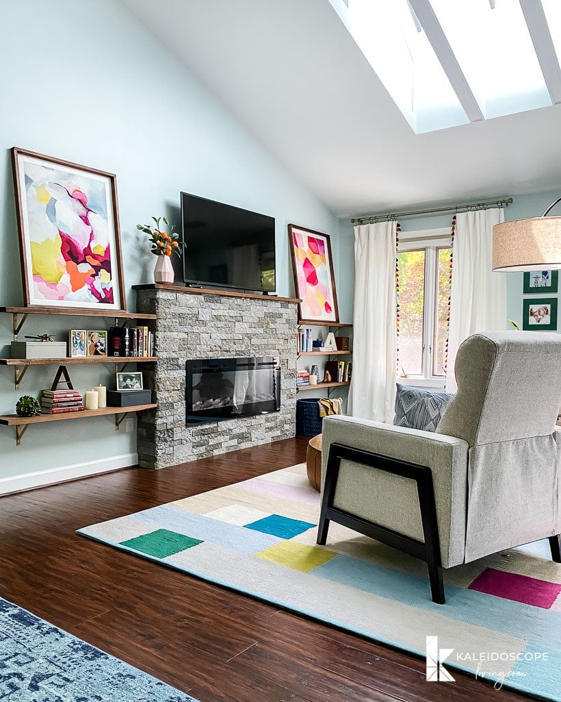
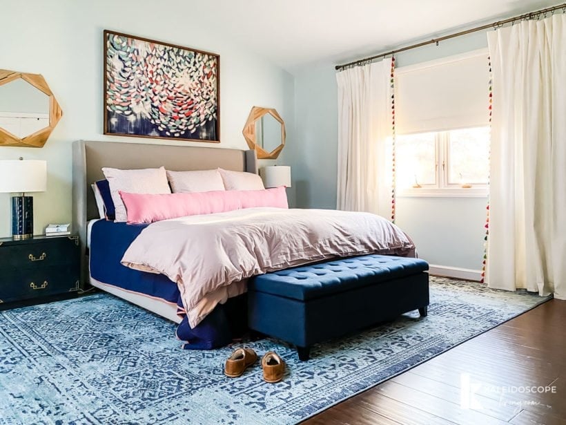
Our master bedroom is large, so it can handle really large artwork in the sitting area, but notice we still have a lot of “white space” so the space does not feel crowded.
Decorating Mistake No. 3: All of your furniture is pushed up against your walls.
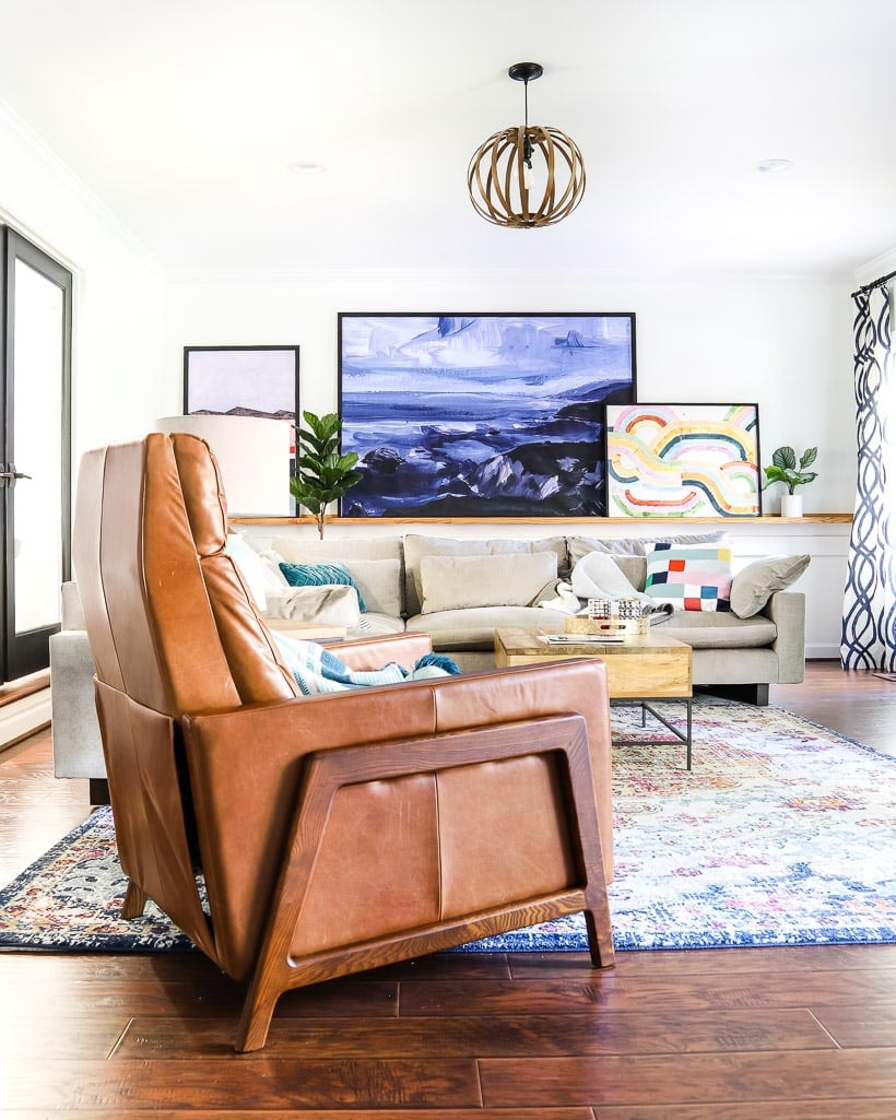
One of the space planning mistakes I see most often is that people push all of their furniture up against the walls. They usually do it in an effort to make their rooms feel bigger. But pushing all of your furniture up against the walls makes a room feel disconnected and unwelcoming. Even pulling some of your furniture off your walls by only a few inches will have a big impact in your room. You can see that I floated all of the furniture in our family room away from the walls. We also floated the furniture in the sitting area of our master bedroom (see picture above). It creates the perfect cozy area in front of the DIY fireplace.
Decorating Mistake No. 4: Your wall decor is all wrong.
When it comes to what to hang on walls and how to hang it, people struggle (if you do struggle, I've shared my thoughts on how to choose artwork that flows throughout your home in a dedicated blog post).
Posts that may help you choose artwork:
- Bedroom Wall Art: Top Designer Picks
- Living Room Art: Top Designer Picks
- Dining Room Wall Art: Top Designer Picks
The most common mistakes I see when it comes to wall decor are: 1) the art or decor is isn't the right size (it's usually far too small) and/or 2) it is hanging way too high.
Now, let's talk about how to fix those two interior design mistakes.
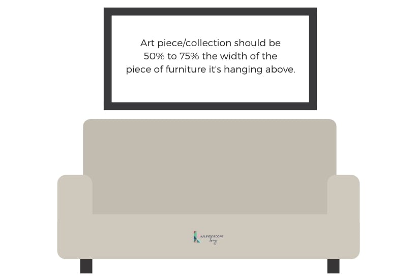
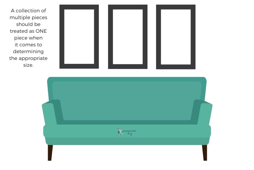
In terms of the appropriate size or scale of artwork, there are a few things to keep in mind. First of all, if you are using several pieces of art or are creating a gallery wall, the entire collection should be treated as 1 piece for the purpose of determining the scale. You want the scale to be proportional to the furniture that they are near. I like art pieces/collections to be at least 50% to 75% of the width of the furniture. Because I find this point a bit hard to explain, I've included some diagrams for you below.
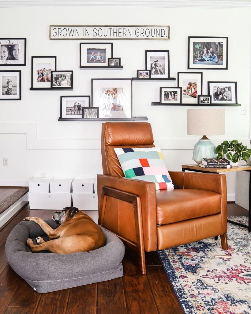
A good example of treating a collection of smaller items as 1 large “piece” can be seen in our family room gallery wall.
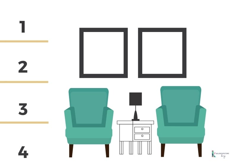
Now let's talk about the height at which your art should be hung. A lot of people say it should be hung “eye-level” and I think that's a helpful rule of thumb. BUT if you are very short or tall OR your ceilings are anything other than standard height, the “eye-level” rule doesn't really work. So, I prefer to think of cutting up walls vertically into 4 sections and hanging the art so that the bottom of it roughly corresponds to the bottom of the second quadrant (it's okay if the top of the art extends up into the top quadrant). Again, see the diagram below :)
Decorating Mistake No. 5: Your room doesn't have a focal point.
When you walk into a room, it should have at least one very clear focal point (large rooms like our master bedroom may have more than one). What is a focal point? It's just a place that your eye naturally wanders to and focuses on. There are obvious choices in some rooms. For example, a fireplace in a living room is a very easy and natural focal point. In a bedroom, the bed itself is usually a natural focal point. Which is definitely true in our bedroom. However, because the room is so large, there is a second focal point in the sitting area part of the room. In that area the DIY fireplace we installed acts as the focal point. We also added skylights to add some architectural interest.
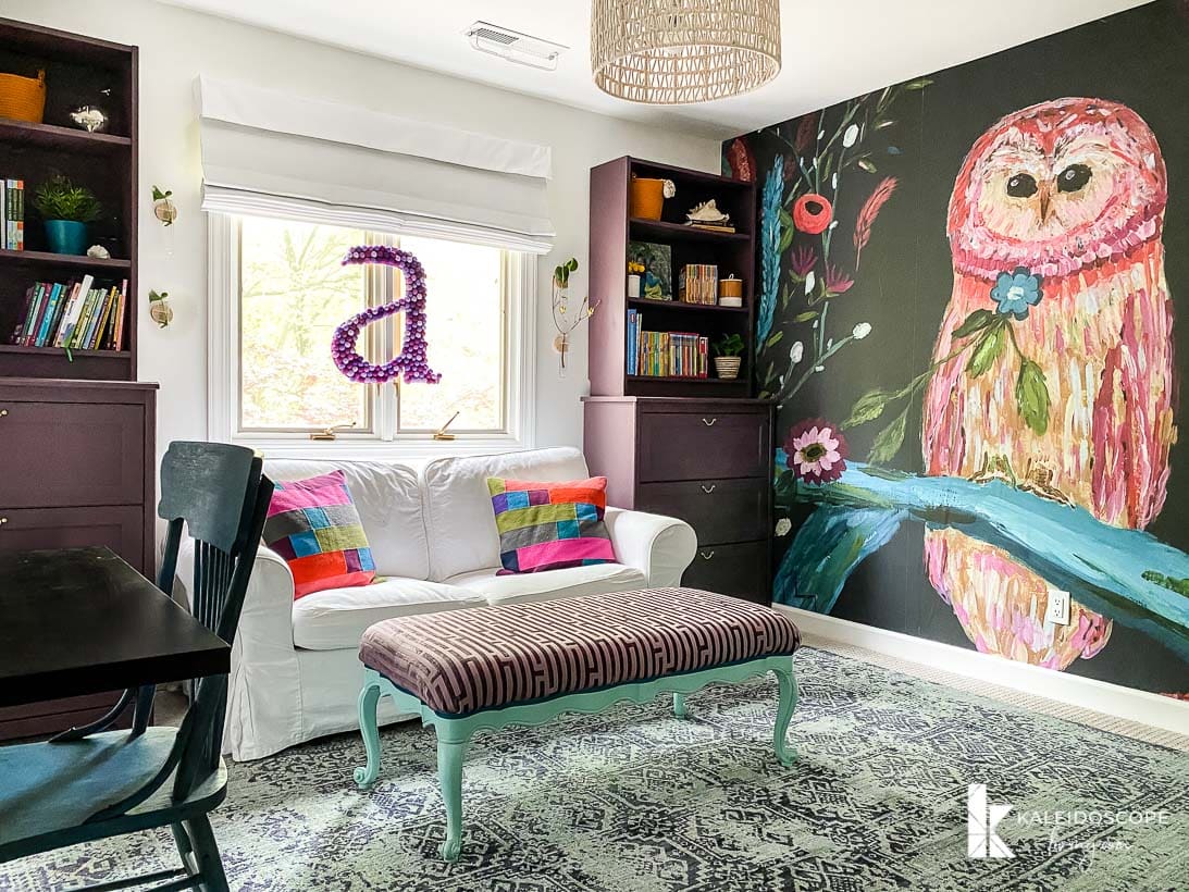
Other rooms that don't have permanent features like a fireplace or built-ins are more challenging. In those cases, you have to create your own focal point. But don't panic. A focal point can be as simple as a large painting or tapestry hung on the wall. In Avery's room the DIY built-in bunkbeds are tucked away in what used to be a closet, so it isn't a natural focal point. We chose a colorful wall mural and it is the perfect focal point! We were able to decorate to show off the mural because here's the thing… Your room needs a focal point before you decide where to place your furniture. You want to place your furnishings around your focal point.
Decorating Mistake No. 6: You picked your paint color first.
There are some very important tips and tricks to follow when choosing paint colors for your home. The single most important tip is NEVER pick your paint color first! I used to do this, and it resulted in me repainting more rooms than I can count. Don't do this! And once you do get to the step of choosing a paint color, be sure to test paint samples on your actual walls (please don't rely on paint chips–they aren't even made from real paint so they aren't accurate).
Instead of rushing out and picking a paint color you love as the first step in the design process, I recommend deciding on what I call your “crucial element” first. Put simply, find the one thing that makes your heart go pitter-patter and make that the jumping-off point of the room. It could be a rug, a piece of artwork, a piece of furniture, or even a throw pillow.
It is much, much easier to choose a paint color based on a “crucial element” than it is to find elements that compliment a paint color you slapped up on your walls. Promise. Unless you are going for an all-neutral room, it is ideal if your “crucial piece” has a pattern and multiple colors. You can then use it to help you decide on the perfect paint color.
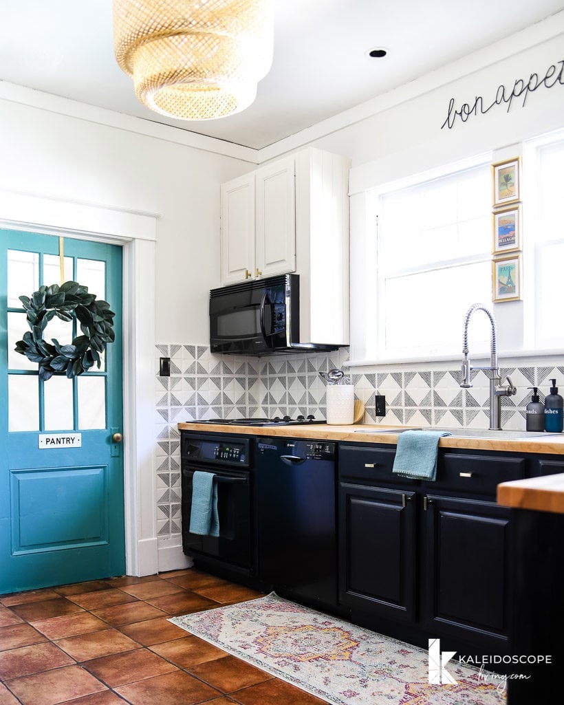
For Thea's kitchen, I started with her runner. It was the perfect crucial element and provided a great jumping-off point for her wall color, cabinet colors, fixtures, backsplash and decor!
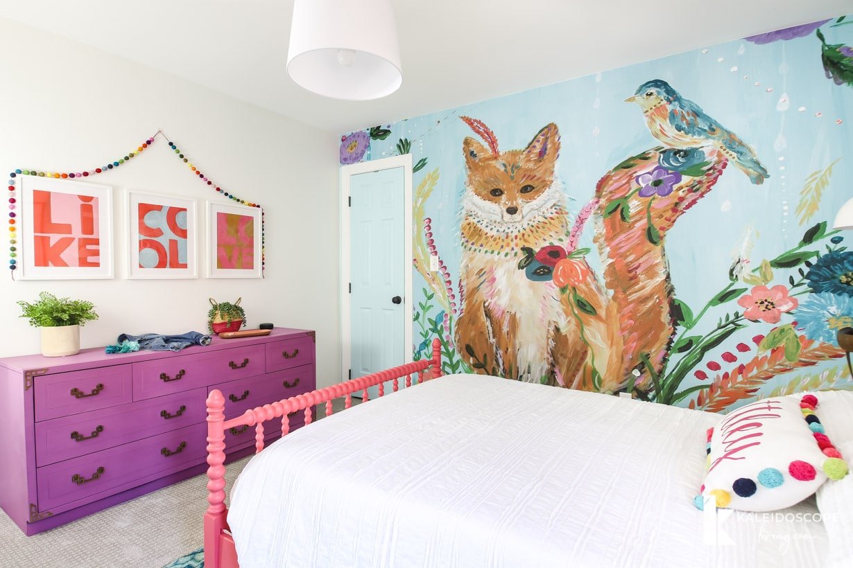
In Attley's room, we chose her fox mural as her crucial element. Once that decision was made, I was able to design the entire room–paint colors, furniture, and special decor touches like the pom pom garland and the pillows (you can find all the sources for Attley's room here). They all look cohesive because I started with my crucial element, the fox mural!
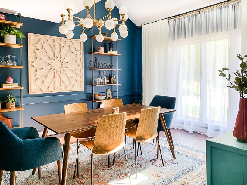
Decorating Mistake No. 7: Your curtains are hung poorly (making your windows look smaller than they are).
You should hang your curtains higher and wider than your actual window whenever possible. This is particularly important when you are trying to make a small room look bigger! Instead of hanging your curtains at the top and outer edges of your window frame, you want to hang your curtains as high as you can and you want them to extend beyond the width of your window. You can see what I mean in the photos below of our dining room.
The “before” photo below shows you the size and placement of the window.
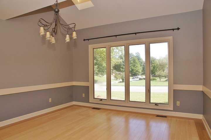
See how the curtains are higher than the window? And see how they extend beyond the window itself (covering portions of the wall)? Both of these “tricks” make the windows seem even larger than they are.
Decorating Mistake No. 8: The patterns in your décor and fabrics are too similar.
Have you ever noticed how the designer rooms you see in magazines and on TV include a mix of patterns and textures? Mixing patterns and textures, when it is done well, gives a high-end, designer look to any room.
A major design mistake is choosing patterns in upholstery fabrics and decor (rugs, curtains, throw pillows, etc) that are too similar. While they should share a similar color palette, you need to balance busy patterns (such as florals or toile) with simple patterns (like stripes). Or try mixing unstructured patterns (like ikat) with a bold geometric pattern.
You also want to vary the size of your patterns. In my opinion, every room should include a large-scale pattern. It doesn’t matter what the pattern is, but the scale of it should be large (think large flowers or wide stripes). When adding a second pattern, it should be roughly half the size of the first pattern. When adding a third pattern, it should be even smaller than the first two patterns and should act as accents in the room. And so on…
You will also enjoy these posts with similar content:
Wondering how I approach transforming rooms and spaces in our home? Check out Designer in a Binder®.
And if you want exclusive content and behind-the-scenes sneak peeks, be sure to subscribe before you head out!

Last Updated on May 8, 2025

I recently remodeled/redecorated my French Normandy home in my fav soft steals, pinks, whites. Replaced the awful brown backsplash with teal mermaid tail tiles…GORGEOUS…that looks perfect with my swirled brown granite, wraparound almond cabinets with ceramic pink/gold/ivory pulls, blush velvet stools and chairs, oversized Anthro teal sofa. Antiques mix with traditional and modern, every room new wallpaper, jeweled trinkets for the children to seek, Mackenzie reindeer abound, shades, chairs, railing may have velvet or lace draped over them…maximalist, romantic, whimsical, elegant so ME!
It sounds like you created a home you love to be in! Yay!